
Microsoft - Azure Quantum
Took onboarding workflows from frustration to flow, elevating success rates from 14.9% to over 70% through user-centered design
Azure Quantum is Microsoft’s cloud-based quantum ecosystem that enables learning, building, and running of quantum applications through provider hardware, simulators, and software tools. My direction was to mitigate abandonment and
Onboarding workflows were defined as the creation of an Azure Quantum workspace and the successful submission of a first quantum job. Telemetry revealed a low 14.9% onboarding success rate, with over 85% of users abandoning these workflows before submitting a first quantum job.
I led end-to-end product research, cross-functional collaboration, and design to redesign three key onboarding workflows: Workspace creation, Overview page, and Sample gallery creation, and to help define the credit program and design the Credits and quotas experiences. This UX/Design leadership improved clarity, engagement, trust, and adoption while reducing abandonment among Azure Quantum users.
Through research, I identified the root causes of attrition and designed more effective workflows aligned with the Azure Fluent design system. This formalized design direction fostered shared UX outcomes and a user-centered culture, improved new-user onboarding, and achieved a near-70% success rate.
Additionally, I contributed to the definition of Azure Quantum’s logo and to its online documentation to further support the end-to-end experience.
Timeframe: Apr ’21 – Sept ‘22
Team: Senior UX Designer (Me), 2x TPMs, 5x Quantum Software Engineers, 1 Technical Writer (Documentation), Branding team (collaboration), Microsoft Legal/CELA (collaboration)
My work: Research, Enterprise UX Design, Design system, Illustration, Branding, Workshop Leader
Onboarding workflows initially only included Workspace creation and Overview page “Quickstart” exercises to submit a first quantum job. The Sample Gallery, Credits and Quota experiences, and the Credits program evolved from my user research and design direction, as well as cross-functional collaboration.
I designed the initial concepts for the Azure Quantum logo. Click here for details and more branding work.
Baseline Research included:
Onboarding workflow telemetry - 14.9% of new users successfully completed the onboarding workflows, while more than 85% abandoned the process. Telemetry couldn’t explain why users were dropping at key points, and research was needed to uncover the details.
An initial PM user study - Nine participants, ranging from quantum developers to researchers and decision-makers, were all unable to complete onboarding first-run workflows within an hour. Outside of the study, some participants ended up taking 48 hours, with others taking more than a week.
Additional User sentiment study - Users felt the Azure Quantum onboarding experience should be more self-explanatory, claiming the experience was fragmented, lacked pricing details, and required frequent back-and-forth with documentation that created confidence barriers to making decisions.
I partnered with Product Management and Engineering leadership to cross-functionally socialize these insights and define the high-level UX Outcome, success metrics, and progress indicators.
High-level UX Outcome:
”Users can easily create an Azure Quantum workspace, submit a first quantum job, learn how to submit subsequent jobs, and clearly understand usage and pricing without contacting support.”
UX initiatives I drove across all work streams:
-
Collected a pool of candidates who were interested in participating in future user research studies.
Created and conducted thoughtful activities that built engagement and fostered relationships that included:
User surveys
User research studies
UX Office hours
Participate in PM office hours
Increased user trust, through creating meaningful user relationships that enabled users to meet their goals.
-
Championed and fostered product team cross-functional participation in user research.
Increased product team cross-functional awareness and understanding of user needs, expectations, goals, and pain points.
Defined initiatives to provide cross-functional visibility, participation, and ownership of user-centered design decisions
-
Improved my personal Azure framework pattern visibility and knowledge.
Conducted design reviews of proposed solutions with the framework team.
Enabled Azure Quantum engineering visibility of new and evolving framework implementation details.
-
Improved content organization, visibility, clarity, and actionability with the documentation team and across online documentation.
Validated documentation clarity with user testing and internal product team review cycles.
Reduced inconsistencies between documentation and inline product “Learning materials”.
* This case study is focused on using Azure Quantum portal onboarding workflows to submit quantum jobs, and does not cover CLI, Quantum Developer Kit (QDK) / VS Code, or Azure Quantum Python SDK options for submitting quantum jobs.
Azure Quantum - Workspace creation
SITUATION:
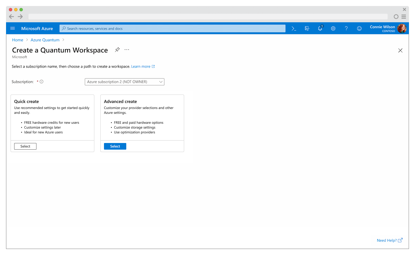
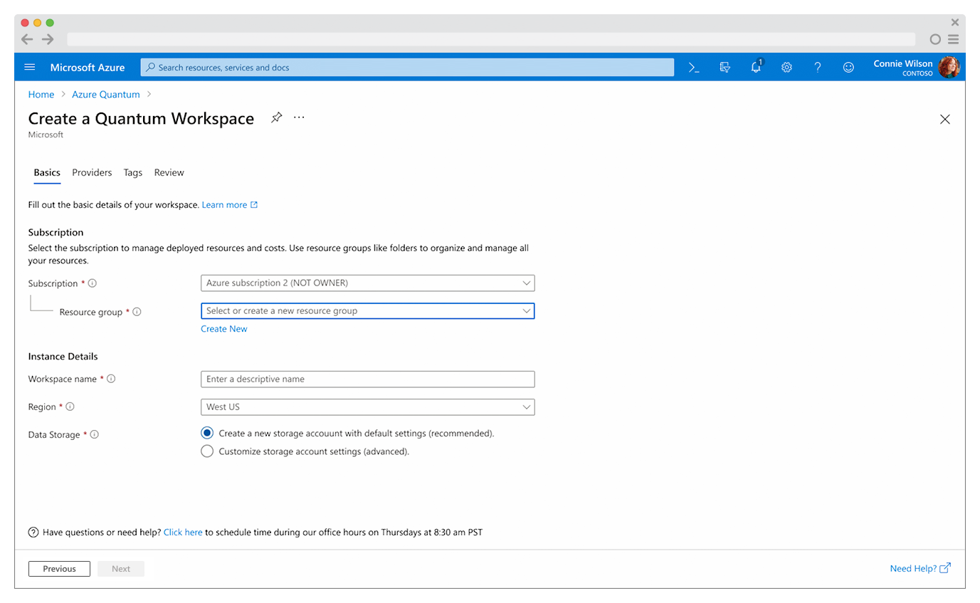
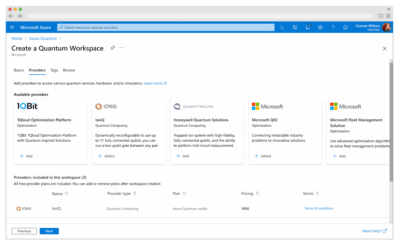
There are four main pages to Azure Quantum Workspace Creation:
Basics / Providers / Tags / Review + Create
Each page had several incremental steps with telemetry insights indicating attrition throughout the workflow, but no indication to explain what was causing it.
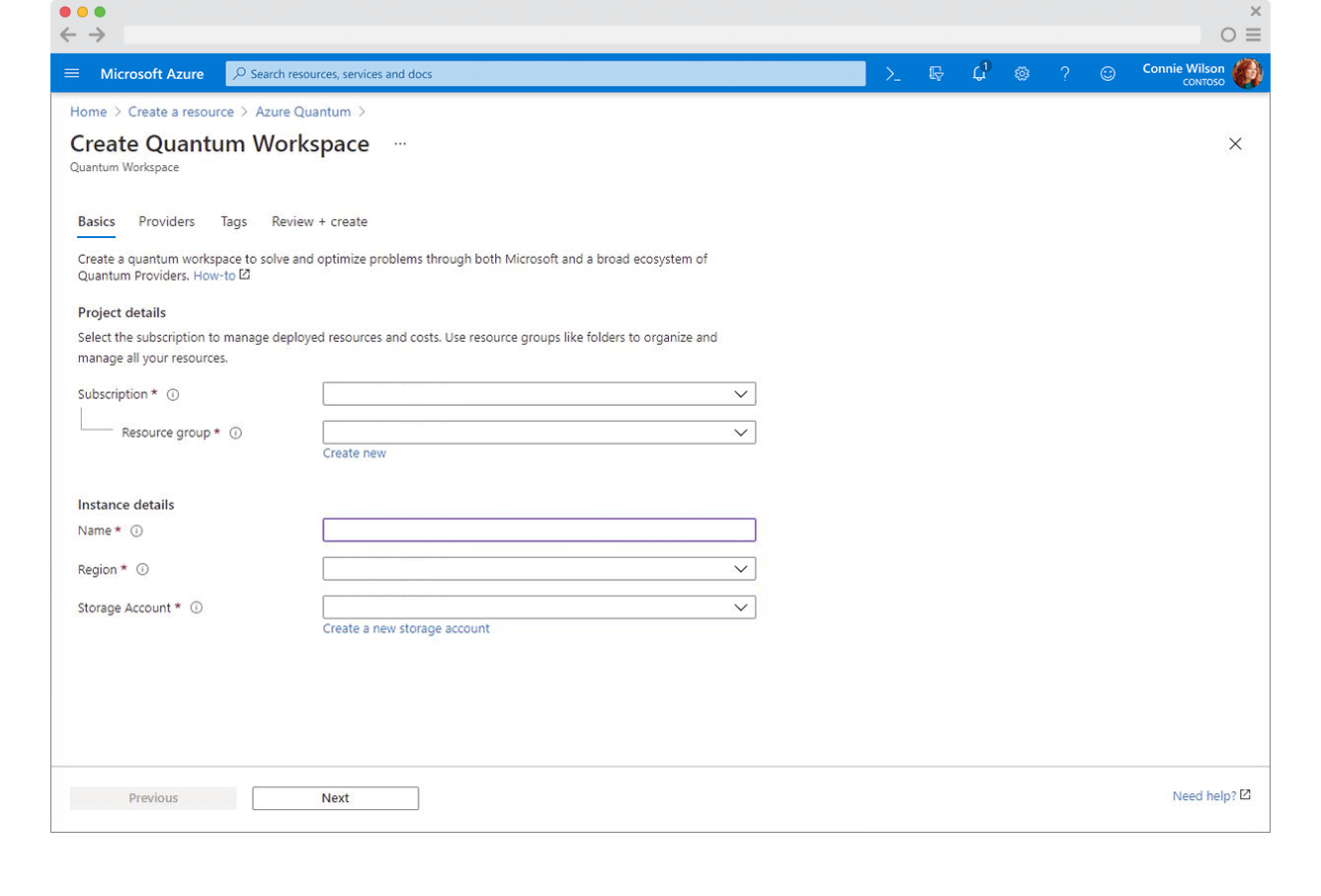


Additional workflow analysis research with quantum thought leaders, researchers, developers, enthusiasts, and practitioners highlighted specific points of friction that contributed to the confusion and high abandonment rates.
Confusing page messaging
Lack of calls-to-action
Lack of familiar Azure pattern alignment and frustration with a disjointed workflow
Frustration and confusion on basic information inputs
Costly and under-informed provider decisions
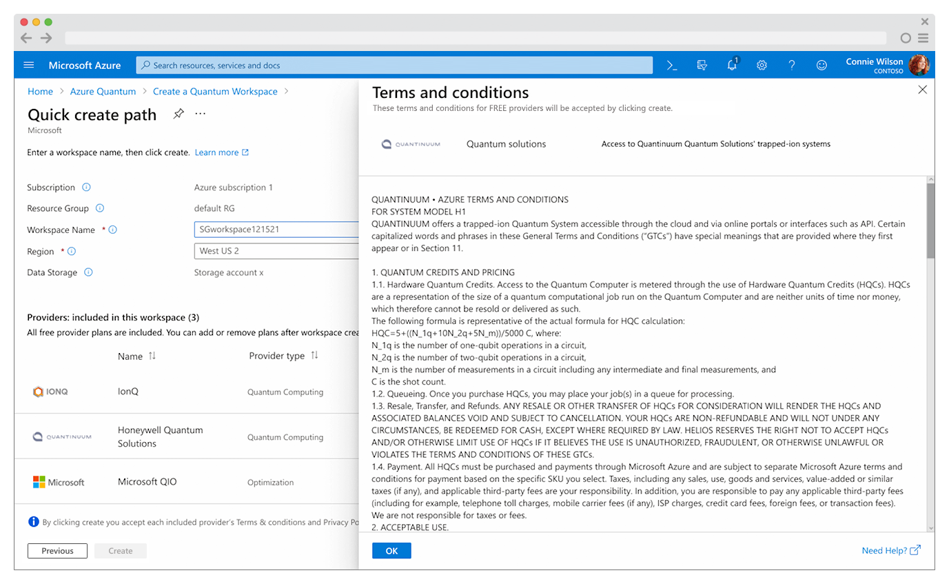
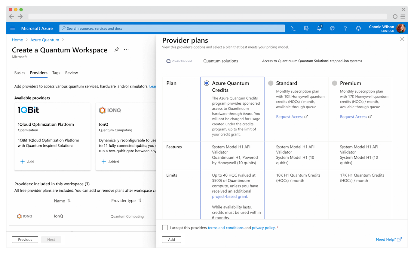
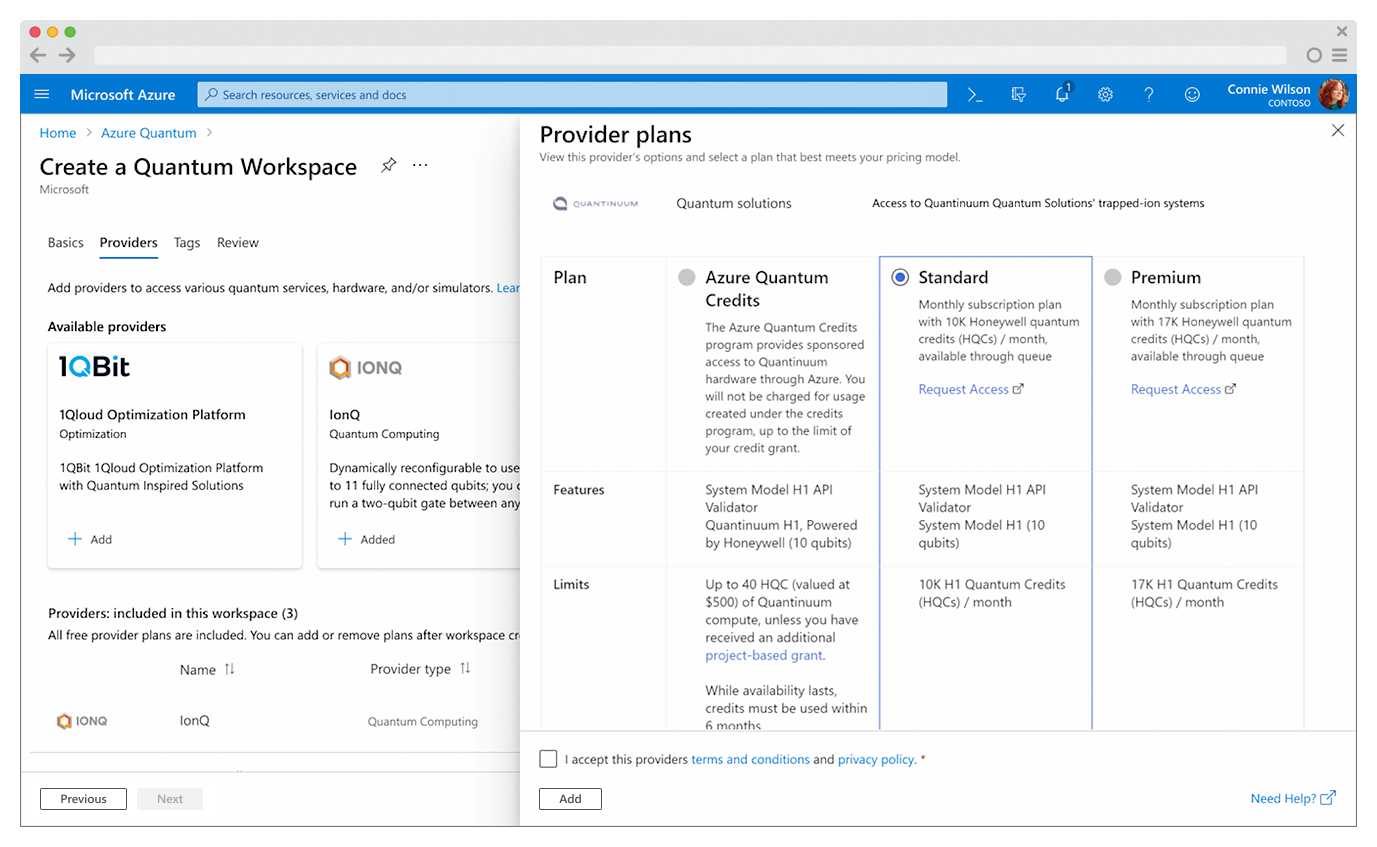
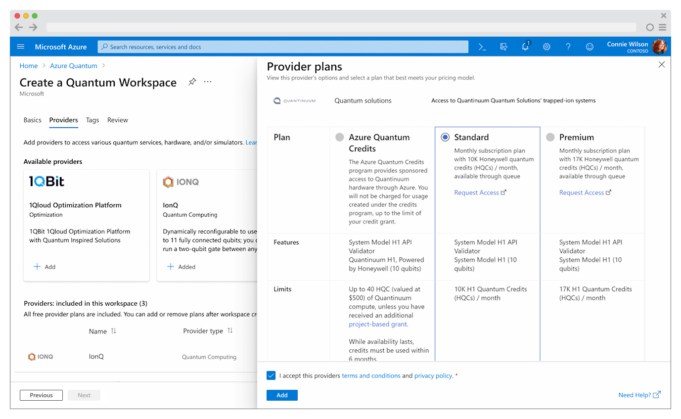
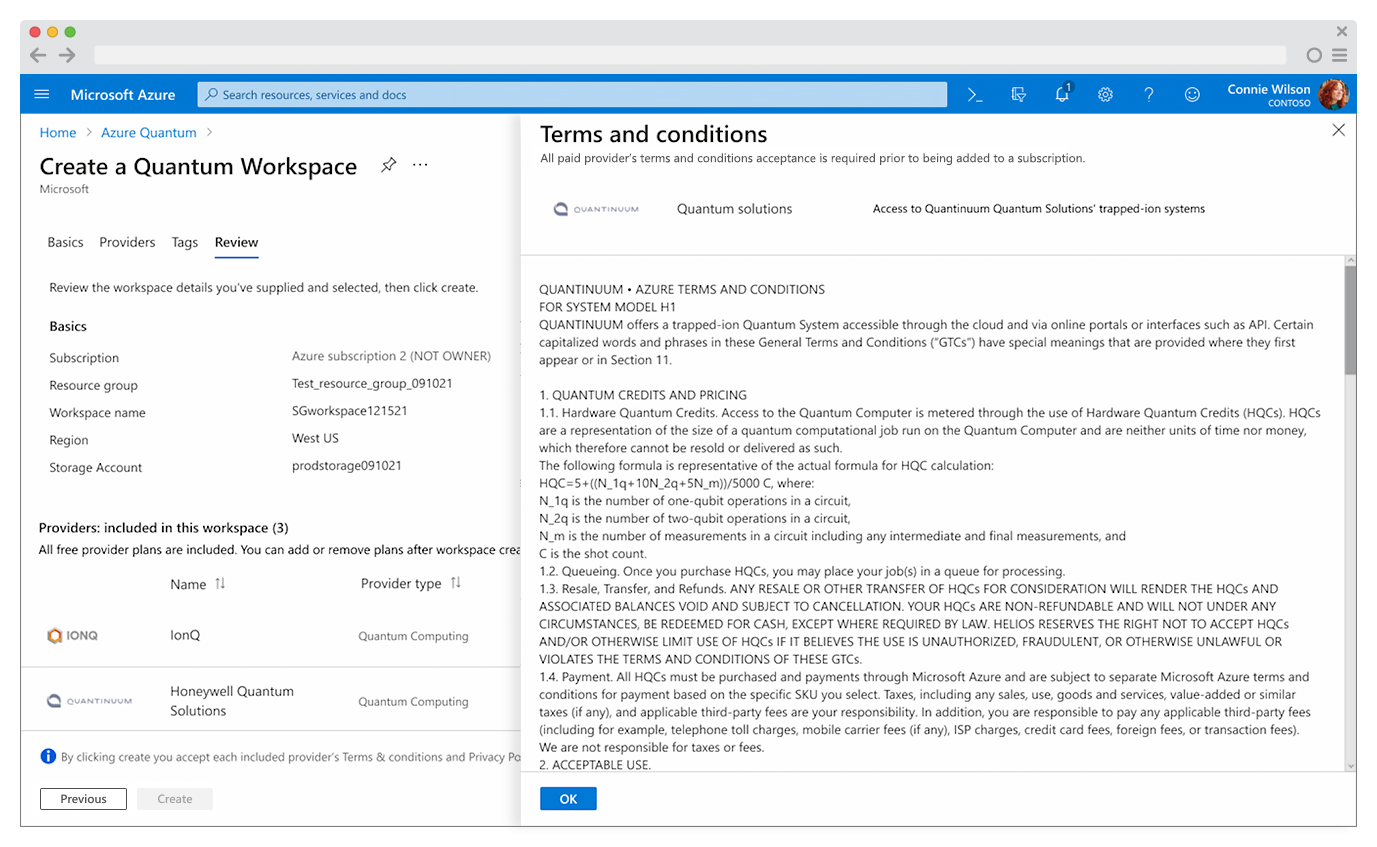
Frustration with Terms of Service (ToC) agreement positioning - ToC details were displayed with each provider during provider selection, but the ToC acceptance was positioned at the end of the workflow on the Create and Review page.
Frustration with overwhelming documentation
“Is it meant to look complicated? Because it does.”
- Research participant
PROCESS:
Synthesized research insights and journey-mapped the user’s experience to provide visibility and a common understanding of the user’s current experience.

Users were not having a pleasant journey.😖
Conducted a workshop focused on simplifying workspace creation, to socialize the design discussion, and gain team input and alignment on onboarding strategies

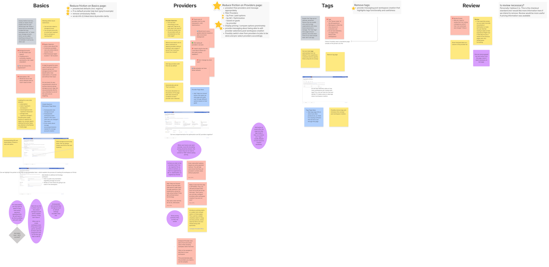
This cross-collaborative approach provided a deep understanding of the user’s experience across the team, enabling co-discovery and co-definition of the desired UX Outcome, success, and progress metrics.
UX Outcome:
“First-time users can easily identify a clear path to create an Azure Quantum workspace and build a higher degree of trust and user confidence through initial success in the onboarding process.”
Success metrics and progress metrics:
-
Increase clarity and trust in the call-to-action through effective messaging
Decrease the time users spend completing each task
Reduce attrition due to the storage account creation requirement
-
Increased user comprehension by clarifying the primary call-to-action
Increase the click-through rate of the primary call-to-action
Increase user comprehension of provider offerings
Reduce decision friction
Reduce Terms and Conditions confusion
Reduce the time needed to select a provider, and improve decision confidence
Improve user trust through pricing clarity
-
Reduce confusion about the requirements of defining tags
-
Reduce confusion about primary call-to-action
Reduce confusion about Terms of Service requirements
Possibly create a bulk acceptance
Possibly create an acceptance coupled / inline with provider selection step
Reduce user uncertainty around selected provider details, associated plans and pricing
Key initiatives -
Optimized workflows — Collaborated with engineering to identify opportunities to provide hint text and prefill values with known user data.
Simplified onboarding flow — Reduced decision points, pricing friction, and cognitive load, enabling faster first-job submission and higher completion rates.
Strengthened framework alignment and advanced Fluent components — Partnered with Azure Fluent PM and Design leadership to ensure consistency across components and patterns, and contributed to component variation design, documentation, and cross-team socialization.
Streamlined compliance — Worked with Microsoft Legal to simplify provider Terms & Conditions acceptance, removing a key blocker in workflow setup.
Enabled data-driven iteration and alignment — Created fully functional prototypes to facilitate design discussions, user research, and stakeholder feedback and alignment.
Validated through testing — User sentiment favored fewer, simpler choices and a “quick-start” low-code path before exploring advanced configurations.
Aligned documentation — Partnered with content teams to update and unify documentation with the revised user flow and design vision.
RESULTS:
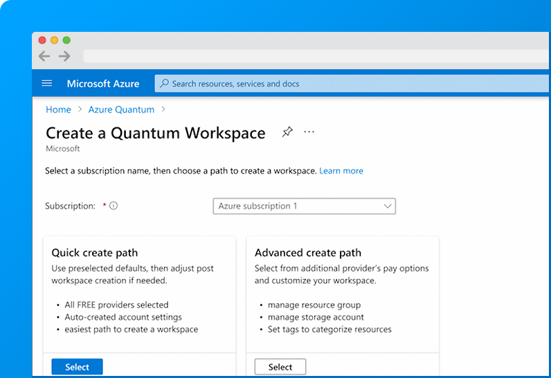
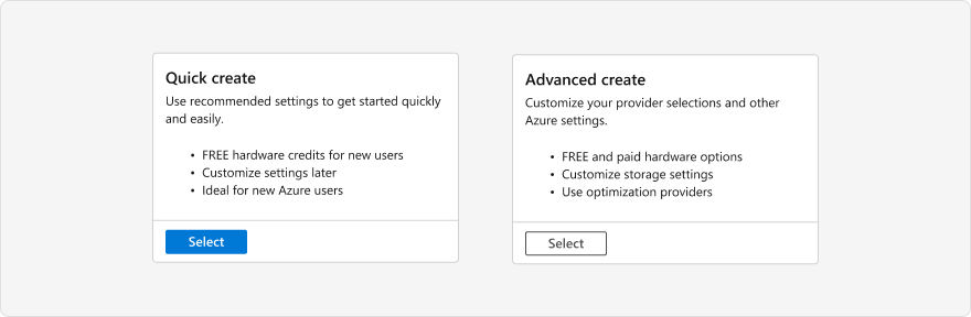
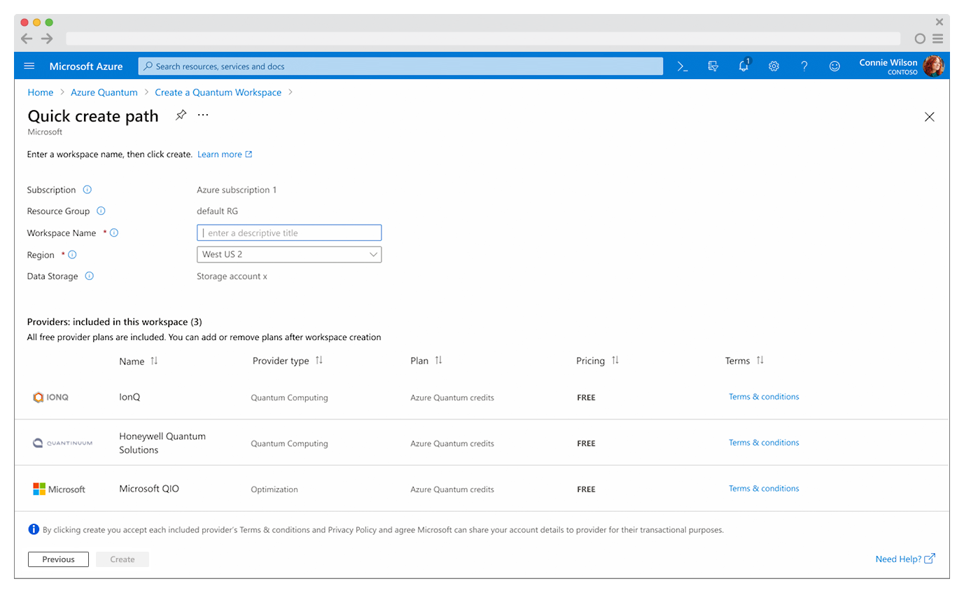
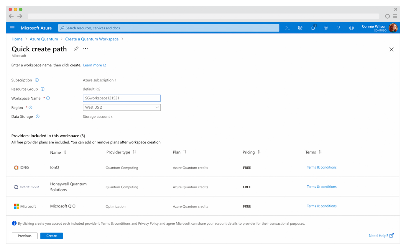
Quick Create path
-
Simplified initial setup by requiring only a workspace name and region, minimizing early decision-making.
Included a default storage account with editable settings post-creation.
-
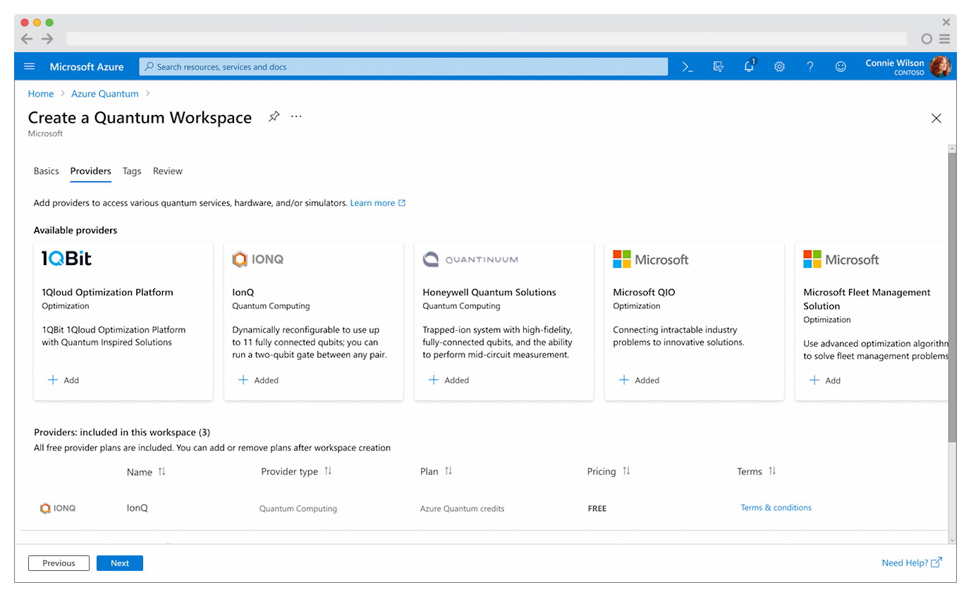
Reduced provider evaluation time by pre-selecting all FREE providers and clearly communicating that selections could be modified later.
Eliminated pricing ambiguity by clearly indicating FREE provider pricing during Review and Create.
Removed unnecessary friction by linking Terms and Conditions acceptance for FREE providers to the workspace creation “Create” action.
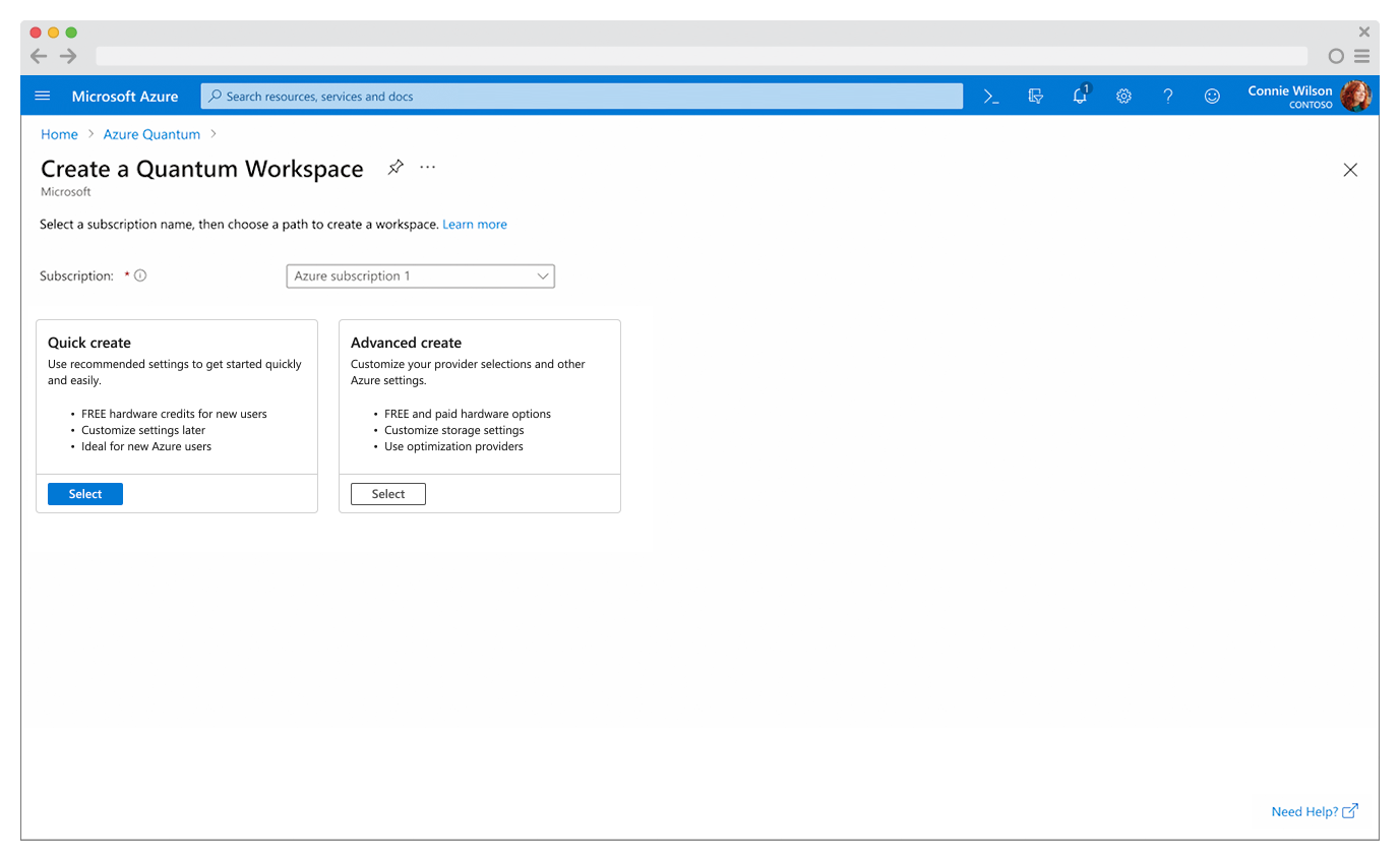
Advanced create path
-
Revised titles to be more informative
Added helpful taglines
Provided inline “Learn more” links to documentation
-
Included inline clarification that users would be able to edit all provider details post workspace creation.
Provided useful hint text in form inputs
Prefilled known user data for:
Subscription
Region
Storage account
Added an option for a storage account with default settings.
-
Added all FREE providers to workspaces being created by default, including one Quantum Computing provider and one Quantum Optimization provider. This enabled free quantum job submission, and reduced errors through subsequent Sample Gallery use, reducing the number of decisions and lowering cognitive load on the pathway to a first quantum job submission.
Improved differentiation between Quantum Computing providers vs Quantum Optimization providers, enabling better clarity and trust.
-
Colocated provider T&Cs acceptance with the Provider “Add” function, enabling intentional association of the agreement with each provider selection.
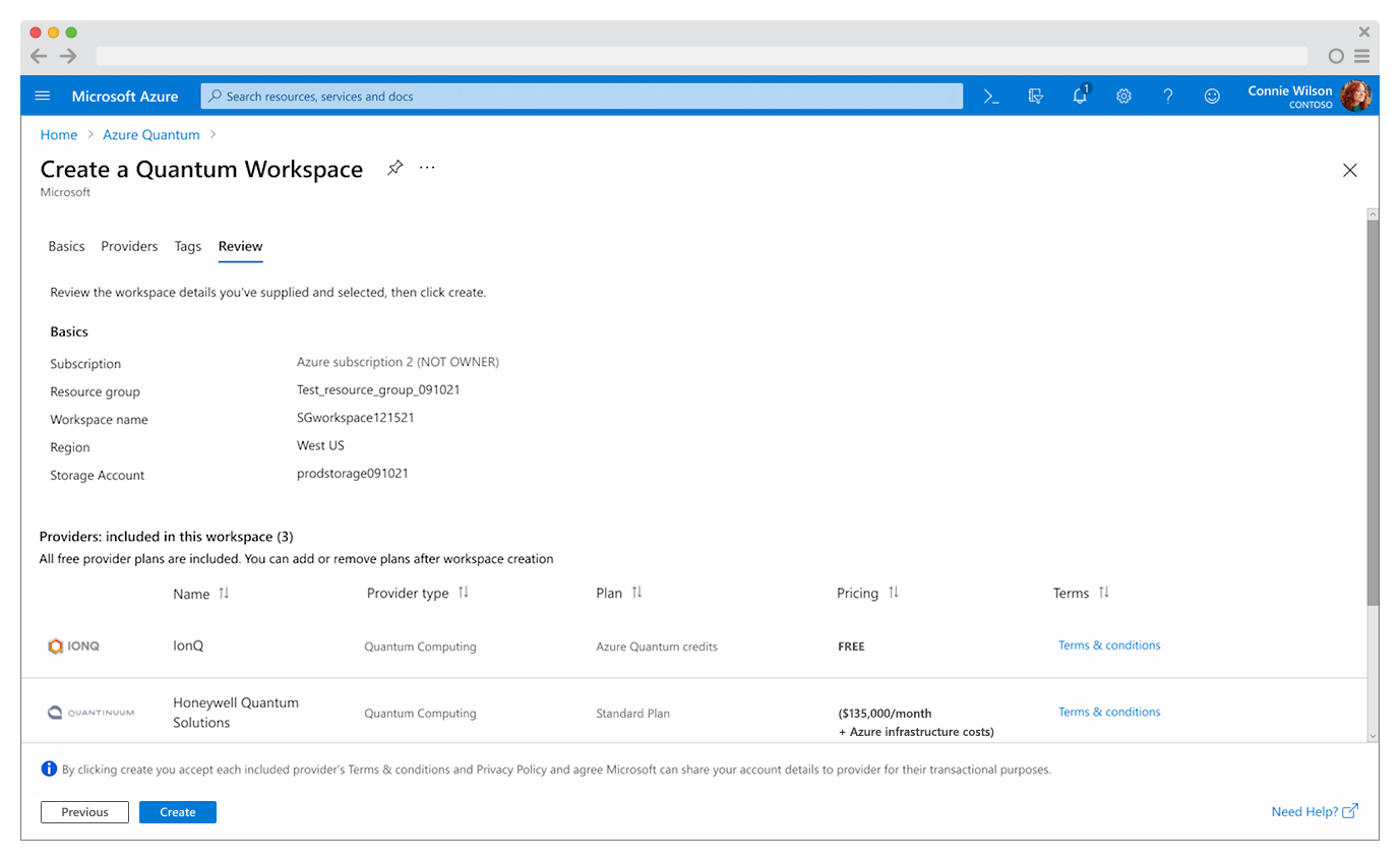
Additional text was colocated with the “Create” button on the last step of the workflow to confirm acceptance of all selected provider Terms and Conditions. This read “By clicking create, you accept each included provider’s Terms & Conditions and Privacy Policy”
-
Provided transparent pricing within the provider details.
Highlighted all FREE providers inline.
-
Standardized documentation to eliminate inconsistencies and improve clarity across the experience.
Reduced user uncertainty around providers, plans, and pricing by aligning in-product “Learning Materials” with authoritative online documentation.
Utilizing account details, we determined if the user had a current subscription and preselected the Quick create path, a two-step workflow that enables near-instant workspace creation. If no subscription was detected, users were led down the Advanced create path.
Quick-Create path - complete workflow
Advanced Create path - complete workflow

This work significantly improved onboarding success, enabling first-time users to create an Azure Quantum workspace in minutes and build a higher degree of trust and user confidence through initial success.
Workflow optimizations and the addition of the Quick Create path increased workspace creation success rates from 35.6% to 42%.
Azure Quantum - Overview page / Getting started
* This workstream ran in parallel to the following micro-case study for Sample Gallery. The outcome of the Overview page / Getting started workflows funneled new users into the Sample Gallery.
SITUATION:
User research revealed that the Overview page and its Quantum Computing Quickstart and Optimization Quickstart options were overwhelming for first-time users, and gated initial success. This process involved setting up your local environment in VS Code, adding the Azure Quantum Developer Kit (QDK) extension, installing any Python updates, and connecting Jupyter notebooks through an Azure Quantum workspace to submit programs to a remote quantum service. If the user wanted to do both quantum computing and quantum optimization, then they had to go through both of these setup configurations. Users were looking for an easy win to take back to their organizations, and these experiences left them feeling frustrated and overwhelmed.

PROCESS:
I conducted initial research with Quantum thought leaders, researchers, developers, enthusiasts, and practitioners to understand users’ perspectives and guide redesign discussions. By enabling cross-functional participation, I facilitated the co-discovery and co-definition of a UX Outcome (ideal user experience), success metrics (goals), and progress metrics (indicators) that we aimed to achieve for the Overview page experience.
UX Outcome:
“Provide a launching point that focuses new users on the easiest pathway to submit a first job, while supporting returning users and enabling sustained user education for all users.”
Success metrics and progress metrics:
-
Improve user confidence through clearer guidance and reduced friction.
Align interactions with Azure Fluent framework patterns for familiarity and consistency.
Simplify workflows and remove distractions from primary actions.
Reduce complexity and frustration within Quickstart experiences.
-
Make the fastest path to submitting a first job immediately identifiable.
Increase success rates for first-time users following the Quickstart path.
Reduce page exits without action by strengthening primary calls-to-action.
Increase engagement with Learning Materials for returning users.
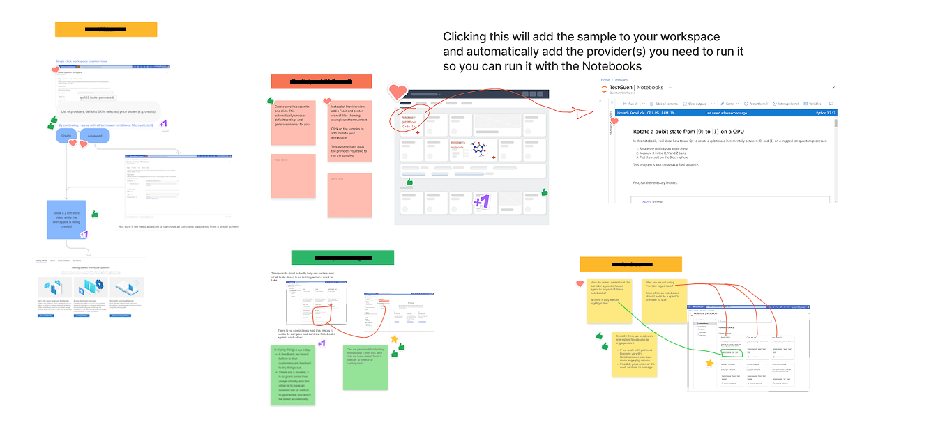
Research highlighted two clear themes that users required to adopt Azure Quantum:
Users needed first-run success, subsequent-run success, and accessible support and documentation, to demonstrate capabilities to their organization.
Users wanted easier Quickstart exercises. One participant suggested integrating Jupyter notebooks (details) into Getting Started exercises, providing pre-made interactive environments as starting points for learning and exploration.
Focusing on Jupyter notebook integration and technical feasibility, I conducted Figjam workshops, design lunch-and-learns, and UX office hours, enabling visibility, participation, and a cross-functional understanding of user intentions, expectations, and goals.
These exercises aligned engineering and product management with a user-centered perspective for the Overview page redesign and the repositioning of “Quickstart” exercises.
Engineering leadership was initially hesitant to prioritize the Jupyter notebook option over local environment setup, so I couldn’t reprioritize the Jupyter notebook option as the “Quickstart” option. Aside from this Quickstart renaming idea, I developed a design proposal to meet the needs of both new and returning users, and enable additional learning opportunities for all users, then conducted usability tests to gather user insights on this idea and present them back to the team.
The design featured a three-panel layout that catered to new and returning users.
Start with Azure Quantum Notebooks – a guided, interactive starting point for beginners.
Access Quickstart Exercises – the local configuration option, and more advanced setup for more experienced users (still labelled Quickstart 😖).
Start with Learning Materials – links to documentation for discovery and deeper user exploration.

I felt this 3-part design direction provided comprehensive coverage for all users’ needs, and it resonated well with the team.
However, in research, users again voiced concern with the local configuration positioned as the “Quickstart Exercises”, they felt these initial exercises were too complex for new users. 4/5 quantum researcher study participants selected the more advanced method over a much simpler option of using templated/premade Jupyter notebooks samples, then ended up confused over the complexity.
When asked why participants chose this option, they said…
“because it’s labeled quickstart”.
This research data was still unable to convince engineering stakeholders that the Jupyter notebooks should be positioned as the Quickstart exercises over local configuration.
From listening to the users directly, I was fairly certain we needed to reposition these two options, so I created two additional variations that prioritized Jupyter notebooks as the Quickstart option:
Variation one - featured a three-panel layout, but labeled Jupyter Notebooks as the “Quickstart” option.

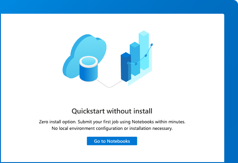
Variation two - completely removed all other calls-to-action, and highlighted the Jupyter Notebook option as “Quickstart without install”.
I conducted one final A,B,C,D usability test with six participants and included all options we had created for the Overview page. These last two variations, which repositioned Jupyter Notebooks as the “Quickstart” option, resonated best with users, with 6/6 users preferring variation two, which presented Getting Started as “Quickstart without install” and repositioned the Local configuration option in the navigation alongside Learning Materials. This option mitigated decision fatigue and decreased the likelihood of early abandonment by deprioritizing the more challenging path.
RESULTS:
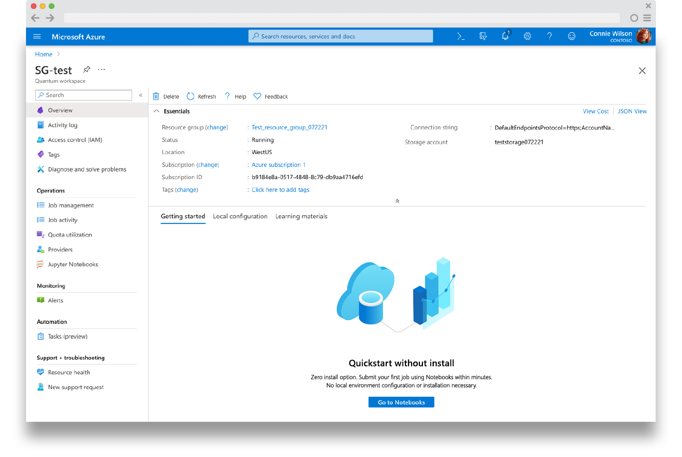
The redesigned Overview page focused the navigation on initial success through “Getting started” experiences and Sample Gallery, while providing “Local configuration” options for more advanced users and empowering engagement for all users through additional “Learning materials”.
Additional benefits of this option included moving Quota usage to the Operations left-side menu, and co-locating it with Credit Usage and Job Usage, creating a more intuitive entry point and a holistic view of usage while removing clutter from the Getting Started workflows.
-
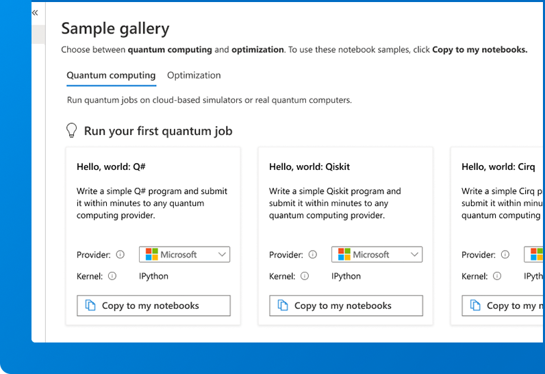
Introduced the Sample Gallery as the primary entry point, providing prebuilt “Hello World” Jupyter notebooks that enabled fast first-job submission.
Reframed Quickstarts as the guided Sample Gallery “Hello World” introductions, removing the barrier to entry that the local configuration and Q# exercises presented for first-time users.
Reduced early cognitive load by eliminating unnecessary setup complexity and focusing users on immediate success.
-
Clarified the primary call-to-action, making the fastest path to submitting a first quantum job immediately visible.
Removed early distractions (Quota Utilization and Job Activity) that were only relevant after jobs were submitted.
Enabled continued engagement for returning users by surfacing advanced samples and learning paths within the same Sample Gallery experience.
-
Embedded concise, contextual Learning Materials to support task completion and reduce support dependency.
Aligned UI patterns with the Azure Fluent framework to increase familiarity, consistency, and confidence.
Unified inline and online documentation into a single authoritative source of truth with consistent tone and information architecture.
* This work and included research, sparked the creation of the Notebook Gallery (explained in the next case-study below👇🏼), enabling user discovery, exploration and learning through templated Jupyter Notebooks to submit Azure Quantum Jobs.
Azure Quantum - Notebook gallery Sample gallery
* This initiative ran in parallel to the Overview / Getting Started workflow, which funneled new users into the Sample gallery.
SITUATION:
Drawing from user research insights, workshops and UX office hours, I partnered with engineering to define the Notebook Gallery and its intent, to teach foundational taxonomy, structure, process, and lower barriers to first success in quantum computing, while fostering long-term engagement through sample-driven task completion using a curated collection of pre-built Jupyter Notebooks. I had created some initial comps for discussions, but due to my focus on competing parallel initiatives, this initial UI was created by engineering and moved to production before a full UX refinement cycle could be completed.
* Jupyter notebooks are interactive environments (details) that provide interactive computing, data analysis, and visualizations in one place, combining the functionality of a document within a code editor.

PROCESS:
Notebook Gallery work began by setting up telemetry and gathering usage data over a 20-day observation period that provided the following insights:
30% of users who visited Notebook Gallery didn’t take any further action, leaving the page.
58% of users who accessed the Notebook Gallery cloned a notebook to use.
50% of these users actually utilized the notebook and ran at least one cell (so 29% of users who initially took action to clone a notebook actually tried to execute a single task).
Only 17% of users who landed on Notebooks Gallery, cloned a notebook, then completed the notebook sample workflow, and actually submitted a quantum job.
In two scenarios where users were trying to submit a quantum computing job using two separate providers, there was a 75% failure and a 100% failure, respectively, due to not provisioning the correct provider during workspace creation.
Additional user research, coupled with this telemetry, was incorporated into workshops and UX office hours discussions, helping to define the UX Outcome we intended to provide users and the success metrics we aimed to improve.
UX Outcome:
“Both new and returning users can easily explore, learn, and build through hands-on, partner-driven examples and submit quantum computing and quantum optimization jobs through Jupyter Notebooks.”
Success metrics and progress metrics:
-
Increase the percentage of users who correctly understand what a Jupyter Notebook is and how it is used to submit a quantum job.
Reduce time-to-comprehension and page-level bounce rates by minimizing content overload and improving scan-ability.
Increase engagement with primary calls-to-action on the Sample Gallery page.
Reduce failed sample runs caused by missing or mismatched QC/QO provider provisioning.
-
Increase the percentage of users who successfully clone a notebook from the Sample Gallery.
Improve engagement with both the gallery page and individual samples through clearer titles, taglines, and descriptions.
Reduce distraction from non-essential content, increasing focus on the primary cloning action.
-
Increase the percentage of users who successfully run at least one notebook cell.
Increase the percentage of users who complete one or more notebook workflows end-to-end.
Increase the percentage of users who submit a first quantum job after interacting with a sample.
Reduce errors and abandonment within notebook workflows through streamlined samples and clearer in-notebook guidance.
-
Increase engagement with learning paths for both new and returning users.
Increase user confidence in Azure Quantum’s provider-agnostic model, measured through reduced confusion and fewer support requests.
Increase repeat usage of the Sample Gallery as an ongoing learning and experimentation resource.
I invited the cross-functional team to participate in usability research, revealing to them firsthand significant usability and communication gaps that led to user confusion, frustration, reduced engagement, and hindered quantum job submissions.
Provided a valuable perspective that enabled a more constructive cross-functional user-centered mindset in workshops and UX office hour discussions
Fostered shared understanding and accountability, aligning teams around UX Outcomes and measurable success metrics.
Key Research insights - leading to low engagement, abandonment, and fewer job submissions:
3 of 6 participants were unfamiliar with Jupyter Notebooks or their intended use.
4 of 6 participants were unable to complete the task of copying and submitting a notebook within one hour.
2 of 6 participants expressed a need for a clearer “Hello World” style introduction to orient new users to the gallery.
Advanced samples were difficult to find; gallery navigation lacked clarity.
Inconsistent notebook explanations and missing contextual guidance.
Unclear messaging, poor labeling, and weak calls-to-action.
Search bar placement and results were ineffective.
Workflow confusion around submitting jobs and provider selection.
Provisioning blockers prevented new users from submitting samples.
UI issues such as unused icons and irrelevant tags cluttered the interface.
No introductory content to support first-time users or guide initial success.
“The page appears visually monotonous and is not optimized for specific use cases.”
- Quantum Educator
Guided by telemetry data and direct user feedback, I focused design efforts on delivering our UX Outcome through a more intuitive, engaging, and user-centered experience. I created all design media, facilitated cross-functional discussions, and led iterative research cycles that rapidly informed and refined the vision.
Key initiatives -
Clarified content hierarchy through more informative category titles, call-to-action taglines, and page messaging.
Renamed “Notebook Gallery” to “Sample Gallery” to better communicate purpose and context.
Refined card components—standardizing titles, explanations, and calls-to-action to emphasize Azure Quantum’s provider-agnostic and code-agnostic capabilities.
Collaborated with Quantum engineers to design more engaging and educational sample experiences.
Aligned with Azure Fluent design system PMs and designers to ensure consistency with Fluent interaction patterns and visual standards.
RESULTS:
Telemetry results:
Within 2 months after implementation, close to 50% of all users who landed on the Sample Gallery cloned a notebook, completed the notebook sample workflow, and submitted a quantum job.
Drastically reduced the 75-100% failure rate of Quantum Computing (QC) gallery samples’ run-ability to a 0% failure rate, through provisioning all FREE QC and QO providers by default during Workspace Creation, enabling users to clone and submit both QC and QO samples upon Sample Gallery entry.
User research results:
-
Renamed Notebook Gallery to Sample Gallery to clearly communicate purpose and intent.
Introduced “Hello World” samples for Quantum Computing and Quantum Optimization to provide an approachable first-run experience and highlight the fastest path to job submission.
Improved understanding of Jupyter Notebooks through inline documentation links, clearer titles, action-oriented taglines, and informative descriptions.
Reduced content overload by introducing clear QC/QO categorization and simplifying page structure.
-
Removed unnecessary UI elements (search bar, info icons, tags) that distracted from the primary action.
Focused attention on Sample Gallery content and the core call-to-action: cloning and running samples.
Increased engagement through clearer, task-driven sample presentation at both the gallery and individual sample levels.
-
Partnered with Azure Jupyter Notebook teams to align on engagement best practices and notebook interaction patterns.
Streamlined notebook workflows and messaging to improve first-cell execution success.
Eliminated provider-related failure by enabling at least one FREE QC and one FREE QO provider during workspace creation—reversing high failure rates to 100% workflow completion success.
-
Supported onboarding and continued learning with samples designed for both new and advanced users, created in collaboration with quantum developers and researchers.
Increased awareness of Azure Quantum’s provider-agnostic model through per-sample provider selection and kernel/language selection where applicable.
Positioned the Sample Gallery as both an onboarding mechanism and an ongoing experimentation and learning resource.
After 6 months, 88% of surveyed users agreed with the statement for the redesigned experience: “Sample Gallery is integral to learning, exploration, and understanding of Azure Quantum's offerings.”

“They're super, super stripped down, like the simplest possible kind of thing, really just showing how it all just fits, which is perfect. It gets you started, so it does what it's intended to do.”
- Quantum explorer
The Sample Gallery redesign balanced the needs of first-time and advanced users, featuring “Hello World” options to guide new users through their first quantum job, while providing advanced samples and learning resources for returning users.
Azure Quantum - Credits and quotas
SITUATION:
User research on the Credits and Quotas experience revealed that many users faced difficult conversations communicating funding needs within their organizations. Users explained that the Credits and Quotas experience wasn’t helping these conversations, describing the existing dashboards and visualizations as confusing, ambiguous, and lacking actionable insights, making it difficult to interpret usage or justify ongoing investment in quantum research and using Azure Quantum.

PROCESS:
I conducted user research to gather insights, highlight opportunities for optimization, and frame the above challenge to the team, focusing our efforts on presenting a more intuitive way to display quota and credit details.
Key Research insights -
Across two separate studies (12 participants total), users consistently identified five key pain points that eroded comprehension, confidence, and overall trust within the Credits and Quotas experience.
Confusing, subjective data visualizations made it difficult to interpret usage or value.
Missing subscription quota and credit breakdowns limited transparency into available resources.
Insufficient pricing and usage data left users unable to make informed, high-cost decisions or facilitate meaningful budget discussions with their organizations.
Unclear credit program details and lack of self-service options for requesting credit increases or upgrades led to user frustration.
Dependence on Azure Quantum support for basic inquiries increased operational overhead for support and product management teams.
Cross-functional participation throughout this research enabled co-discovery, co-definition, and alignment on the UX Outcome and the success and progress metrics necessary to guide a more transparent, user-centered design direction.
UX Outcome:
“Users can clearly understand credit and quota usage to easily make determinations about their organizational usage needs, and take action to remove credit and quota limitations and alleviate pricing concerns.”
Success metrics and progress metrics:
Initially, there was nothing to measure with telemetry in the experience, as it lacked tasks, workflows, calls-to-action, or instrumentation to apply telemetry to. User research provided the following details.
-
Increase the percentage of users who can accurately understand credit and quota usage at the subscription, workspace, and provider levels.
Increase user confidence in credit and quota data through standardized, familiar usage visualizations.
Reduce user-reported uncertainty related to credit and quota interpretation.
-
Increase the percentage of users who can identify available credits, quotas, and pricing plans directly within the product.
Reduce time and dependency on support or product management teams to increase quotas or add credits.
-
Increase user awareness of the Azure Quantum credit application process.
Increase the number of users successfully applying for and receiving Azure Quantum credit awards without direct support intervention.
Aiming to achieve our UX Outcome and improve trust in the Credits and Quotas experience, I focused design efforts on clarity, transparency, and aligning on common usability patterns, validating these solutions through user research and socializing insights with the team.
Collaborated with the Azure Fluent framework team to explore data-presentation patterns, aligning on a table layout commonly used for displaying usage results.
Iterated on minor data visualizations within these table components, driving component evolution, documentation updates, and broader system adoption.
Developed functional prototypes to facilitate design discussions, gather feedback, and refine the vision through rapid iteration.
Iteratively A/B tested table-based proposals to evaluate how effectively they communicated credit and quota data in a familiar, easily interpretable format.
Socialized research findings and design proposals across Product Management and Engineering via cross-functional presentations and weekly UX office hours, ensuring alignment and shared ownership of outcomes.
RESULTS:
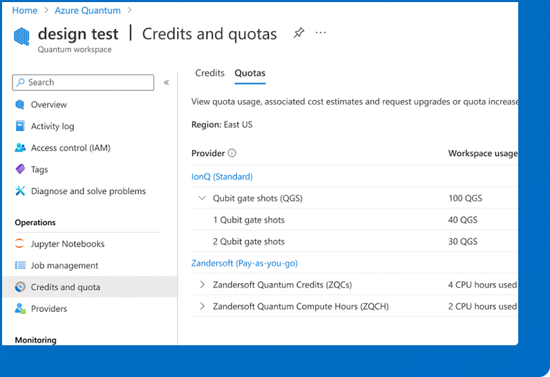
Created the Credits and Quotas central hub for users to view and manage their Azure Quantum provider resources effectively.
-
All users could accurately describe credit and quota usage, per provider, at the subscription and workspace levels.
Standardized Azure framework table patterns and simple bar visualizations made usage data easy to scan and understand.
Expandable provider rows clearly communicated available plan types (Standard, Pay-As-You-Go, Credits).
-
Users could directly increase quotas from the Credits and Quotas table for provisioned providers.
Users could easily apply for or request credit increases through in-product links without relying on support.
-
Enabled provider-specific credit applications directly within the product.
Awarded credits to quantum researchers contributing to Sample Gallery content.
Supported university adoption through academic credit awards.
Incentivized UX research participation through credit grants.
Credits dashboard -

Quotas dashboard -

“ What really made the difference was these credits, this credit program that allowed us to experiment with what we were doing without using our own budget, which is very limited, so that was for us a game-changer. ”
- Quantum Innovator
The redesigned Credits and Quotas experience provided valuable user insight, inspired trust in Azure Quantum, and lowered the financial burden of learning quantum computing and quantum optimization. Users could manage quota availability and credit usage, request upgrades, apply for grants, and better plan for future projected costs and funding discussions within their organizations.
Overall impact
Final usability testing showed a 70% (7/10 participants) success rate for first-run workflows with quantum job submissions, marking a major leap in user trust and onboarding efficiency for the Azure Quantum program.
These UX design outcomes significantly improved user confidence, engagement, and productivity, enabling Azure Quantum users to achieve their short-term quantum goals, plan for funding conversations, and develop long-term quantum strategies within their organizations.
UX initiative results -
-
Expanded the research participant pool by partnering with Product Management and Support and building user trust.
Centralized research participant tracking (roles, needs, concerns, availability) to improve visibility and coordination.
Sustained engagement through lightweight surveys, UX and PM office hours, initiative updates, and research-linked Azure Quantum credit incentives.
-
Increased product, engineering, and documentation team participation in user research and design activities.
Drove participatory design through research readouts, hands-on workshops, and weekly UX office hours.
Improved shared understanding and alignment through regular insight socialization and ongoing collaboration.
-
Deepened alignment with the Azure Fluent design system through ongoing documentation review and bi-weekly design reviews.
Increased engineering awareness of evolving system patterns, requirements, and UX standards.
-
Increased accuracy, consistency and alignment of in-product workflow guidance and online documentation.