Infogroup/Data Axle - Platform team
Achieved higher quality data and a 97% efficiency gain in data processing by automating and optimizing high-friction workflows
Infogroup was a consumer and business data provider supporting marketing lead generation, constrained by operational overhead from fragmented workflows, redundant systems, and legacy on-prem infrastructure that limited scalability and data quality.
I led UX research, cross-functional collaboration, and design direction across the Data Axle platform, defining a systematic, outcome-driven approach to unify workflows and guide cloud-first engineering execution. This work informed the following four workstreams, delivering a real-time, end-to-end B2B and B2C data platform with clear user-facing services and documentation. This positioned Data Axle as Infogroup’s leader in data quality, and enabled more efficient, scalable data-driven marketing solutions, and ultimately drove the company’s rebrand to Data Axle.
Timeframe: Dec. '15 – Oct. '20
Team: Senior UX Designer (Me), CTO, 3x PMs, 8x Engineers
My work: Research, Internal tooling, Design system, Illustration, Documentation, Branding, ML augmentation, 0-1 innovation

“Words truly cannot express the value that the Data Axle platform delivers
to the company and how vital the platform is to our strategy - the best
proof is without doubt the rebranding of the entire company from
Infogroup to the Data Axle”
- Mike Iaccarino - 2019 - Data Axle CEO
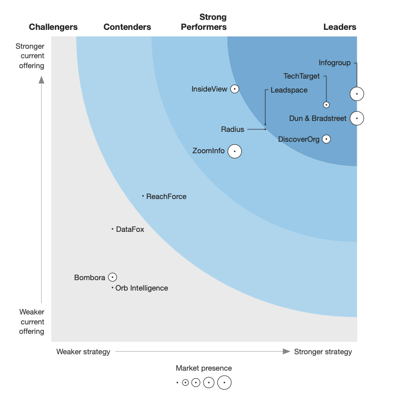
Infogroup announced as a leader in the 2018 Forrester Wave - B2B Marketing
Data Providers
< Back to top
Data Axle - Platform tooling
This case study is focused on Merge Review software while outlining the research and design approach applied across all internal tooling for Place Management, Tally Reports, Fill Rate Reports, Corporation Management UI, Feedback UI, and a Version History UI. All platform tooling work was in collaboration with Data Processing, Engineering, Product Management, and Support teams.
This work influenced three main demographics:
Product team - PM, Design and Engineering -
Standardized user-centered research and established a unified design pattern library, eliminating ambiguity and reducing design and engineering debt. This alignment freed engineers to focus on technical execution, accelerated product cycles, and reduced operational overhead.
Data processing users -
Provided a consistent, cloud-based experience with clear calls-to-action and data-informed workflows. Users gained greater visibility into how their contributions influenced overall data quality for B2B and B2C customers.
B2B/B2C data customers -
Enabled streamlined operations and access to real-time data with higher-quality, improved accuracy and availability through API-driven distribution.
SITUATION:
Audits revealed significant opportunities to improve efficiency and systematization and reduce cost across Infogroup’s data-processing operations. Six siloed teams handled ingestion, cleansing, and distribution using redundant manual workflows with no end-to-end ownership, resulting in inconsistent data quality and a time-intensive 6–7 week processing cycle.
The legacy environment relied on a patchwork of single-purpose client tools developed over decades, with minimal consistency in user experience, quality controls, reporting, or workflow design and no cloud integration. Aside from a few early Data Axle automations, these fragmented tools remained the core of Infogroup’s data-processing pipeline.
- Software audit examples - for context -
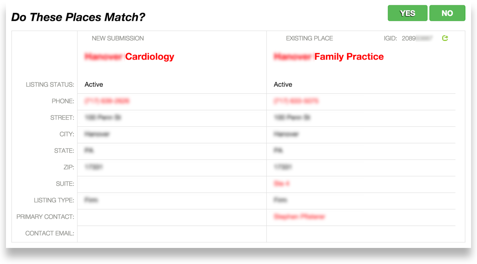
Example 1 - Match UI:
New place submissions moved through multiple disconnected tools managed by different teams. Each record entered Match UI with the prompt “Do These Places Match?” If unresolved, it was routed to Append UI or Merge UI for additional research before returning to New Place UI for final confirmation and entry into the database.
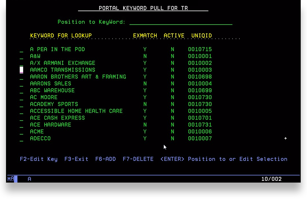
Example 2 - Omaha AS400 database software:
Several tools were built on an ASCII-based, key-code interface running on a legacy AS400 mainframe (circa 1988). While it provided direct access to Infogroup’s historical database and strong reporting capabilities, it carried an extremely steep learning curve, was difficult to update, and required on-premises access in Omaha, creating major usability and scalability constraints.
Example 3 - Omaha data processing workflow:
For large business files, data teams relied on manual spot-checking and partial test runs before full ingestion. This workflow also introduced scalability issues, created inconsistent quality assurance, and slowed processing across teams.
This process relied on using Excel spreadsheet data files (no screenshot included).
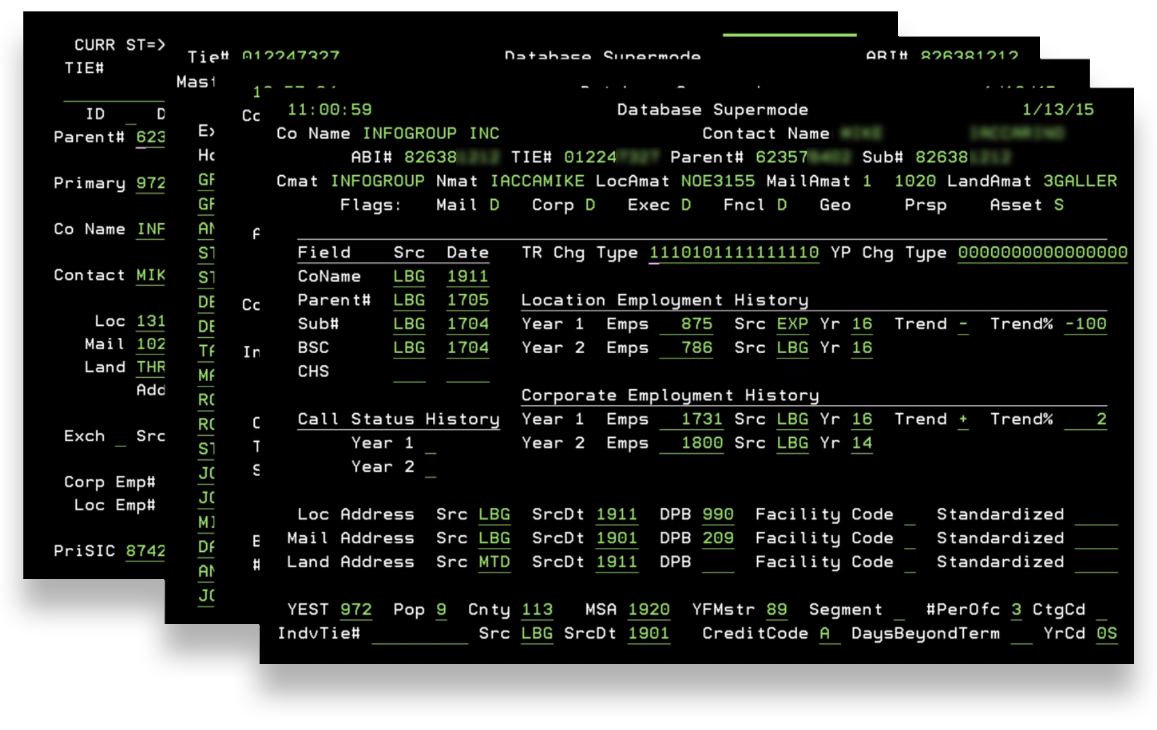
Example 4 - Data Axle data processing software:
This option consolidated many functions of the legacy tools and was the only cloud-based solution in the stack, offering history and reporting capabilities. However, significant usability challenges limited its effectiveness. Despite these issues, it represented the strongest foundation for building a comprehensive, scalable, next-generation data-processing platform.

Situational challenges per demographic:
Engineering challenges -
No consistent user research practice, with many engineers building features in isolation.
Limited visibility and inconsistency across CSS, components, and design patterns.
Fragmented experiences and duplicated engineering efforts across multiple tools.
Six data processing team challenges -
No unified, end-to-end process for ingestion, cleansing, and distribution.
No consolidated reporting or shared quality metrics.
Each tool had its own UX, requiring separate learning curves and workflows.
Data quality was measured inconsistently across teams.
Ingestion and distribution methods varied widely, creating slow and unreliable throughput.
B2B /B2C Customer / End-user challenges -
Monthly data loads delivered outdated, less actionable datasets.
Data quality suffered due to ad-hoc spot-checking and inconsistent measurement practices across teams.
Delivery methods were inconsistent—ranging from express mail and email attachments to cloud downloads—creating unpredictability and inefficiency.
PROCESS:
A substantial amount of iterative research was conducted collaboratively across Design, Engineering, and Product Management, then shared through cross-functional presentations and workshops. This partnership enabled co-discovery, co-definition, and shared ownership of the evolving UX vision and goals that guided the product strategy.
Ideal UX statements - per demographic:
Design and Engineering Teams -
“Design and engineering teams can streamline workflows and reduce overhead through a scalable, component-based framework, eliminating redundancies and accelerating development.”
Data Processing Users -
“Data-processing teams can efficiently ingest, cleanse, and distribute data through a unified cloud-based pipeline, removing manual redundancies and replacing fragmented tools with a single, consistent workflow.”
B2B /B2C Customers / End-users -
“Customers receive accurate, high-quality data at scale from a single, reliable platform—free from delays, inconsistencies, or legacy processing constraints.”
Goals - per demographic:
-
Reduce siloed engineer research efforts.
Establish a consistent, trusted practice for UX-led user research for various sizes of projects.
Reduce duplication of code
Reduce duplication of design patterns.
Increase adoption rate of a shared style guide and component system across engineering projects vs individual silos.
Define and adopt a common style guide, component system, pattern library, and interaction models.
-
Increase data accuracy, fill rate, and quality measurement consistency across data processing pipelines.
Reduce the number of different tools used across teams.
Increase consistency of workflow patterns across data processing experiences.
Reduce redundancies in manual processes.
Combining similar processes
Automate pre-fills of known data
Reduce duplication or siloed team documentation sources.
-
Reduce the 100% of customers that are ingesting monthly loads.
Enable consistent distribution through APIs
Enable scalability and continuous data feeds
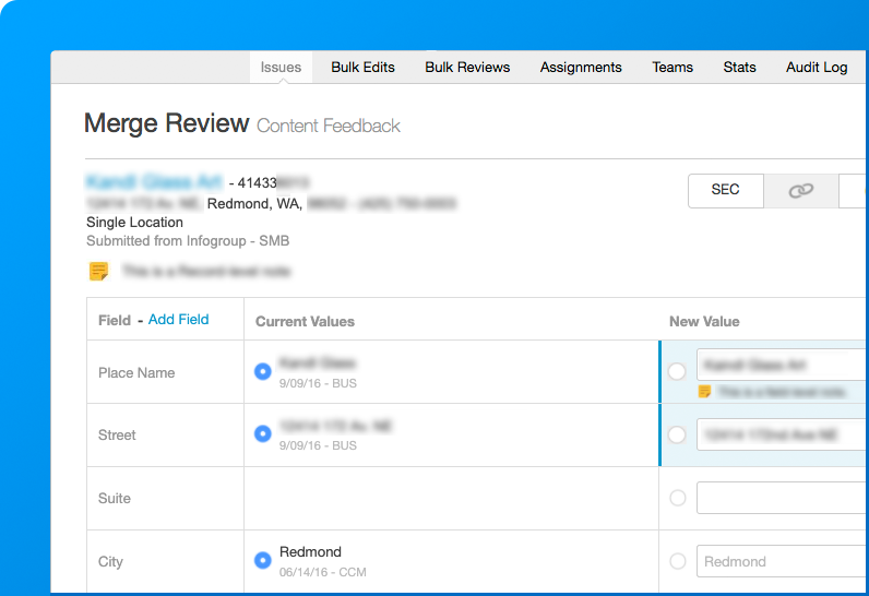
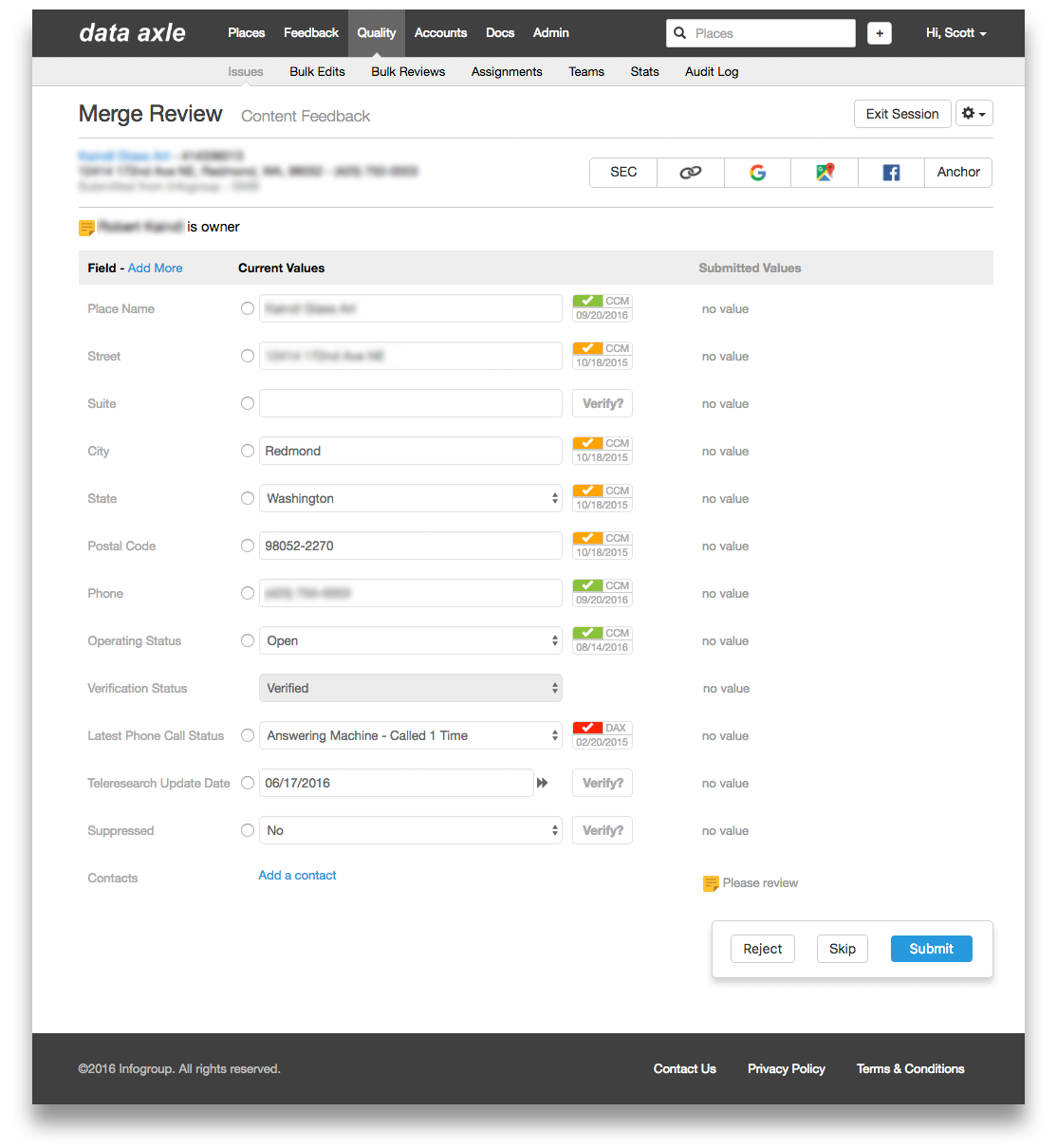
Merge Review redesign V1:
While on-site in Omaha, I conducted ethnographic research using Data Axle’s processing software for Merge Review and identified several UX friction points. With only a few days on-site, I prioritized one high-impact issue, how record research was conducted. Researching submitted values forced users to constantly switch between the UI and external browsers, relying on inconsistent methods like quick keys, bookmarks, or manual queries.
I targeted this as an early win, hoping to streamline the process to reduce context switching and ease cognitive load.
I designed a “research ribbon”, leveraging data we already had within our system, making it easy to repurpose and optimize. This feature included buttons for the five most valuable research methods:
Securities and Exchange Commission (SEC) link
A Google search on the place name
A Google map search on the place name
Facebook link
Any associated anchors
A couple of platform engineers had joined me on the trip and were able to quickly add the research ribbon, so I could validation test with users the next day.

In validation testing the next day, the new research ribbon immediately resonated with users. They were enthusiastic about the inline research functionality and energized by seeing their feedback reflected so quickly. This engagement prompted deeper conversation and surfaced additional usability insights that directly informed the next, more robust round of design improvements.
Standardize Patterns & Improve Page Flow
Establish consistent usability patterns to improve comprehension and reduce engineering overhead.
Redesign layout to support a natural top-left–to-bottom-right reading flow.
Add clear contextual identifiers, Merge Review title and supporting subtitle—to orient users.
Co-locate essential record details (place name, address, IGID, timestamp, data source) for quick recognition.
Add a record-note field to capture user findings, automatically stored in the record history.
Increase Efficiency & User Control
Consolidate Submit and user action controls within a unified bottom-right action panel aligned to user reading and interaction patterns.
Add Skip/Reject functionality to let users bypass indeterminate records without impacting performance metrics.
Enhance Calls-to-Action & Visual Feedback
Refine the research ribbon with branded icons and color accents to improve discoverability and reinforce visual hierarchy.
Apply a dynamic highlight state to the Submit button after edits, to clearly signal readiness for submission and reinforce system feedback.

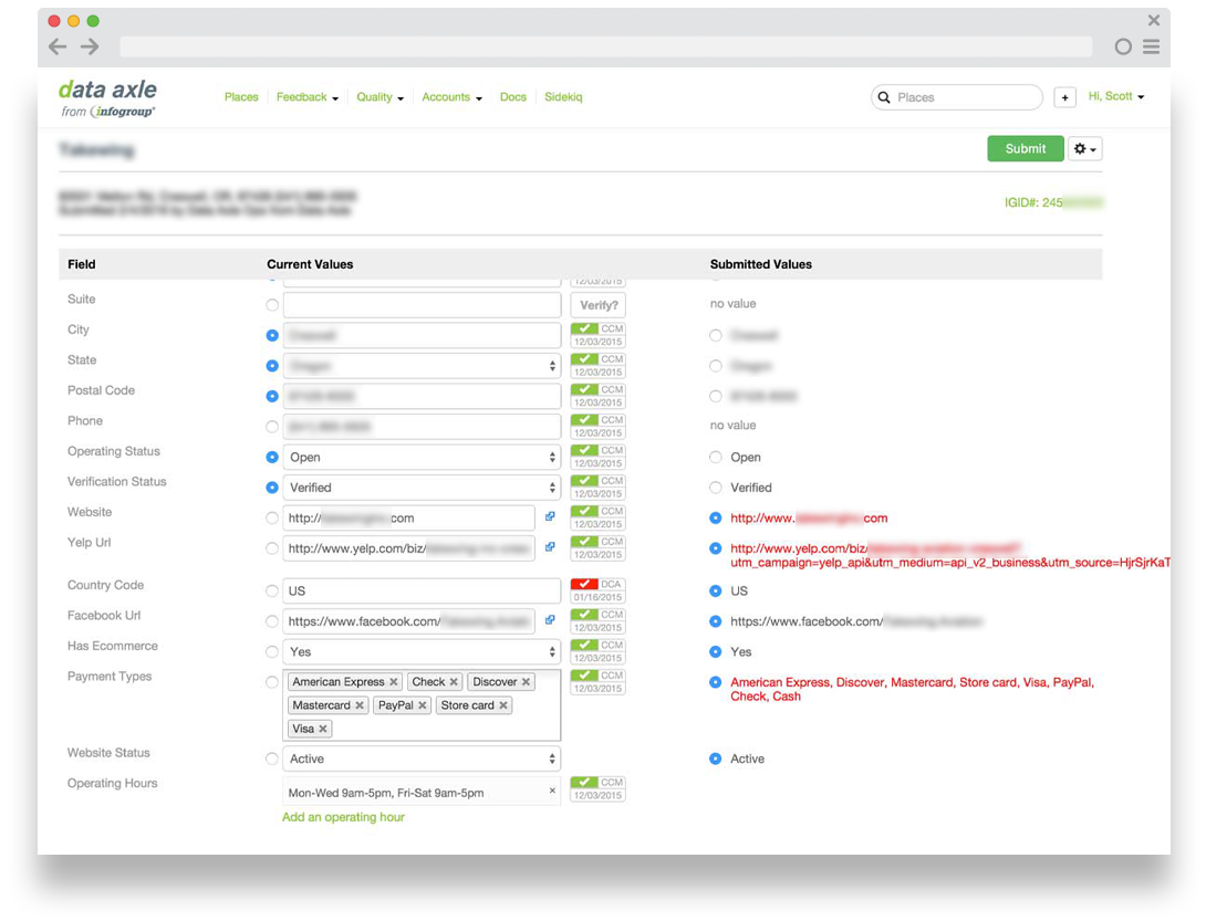
Merge Review redesign V2:
Following the platform rebrand and insights gained from parallel design initiatives, I led a comprehensive Merge Review redesign the following year, advancing both core functionality and the maturity of our platform’s software design language. Several incremental updates had been released in the interim, as reflected in the comps below, including early phases of the Data Axle UI redesign and rebrand.
I began by conducting and synthesizing baseline research with senior stakeholders, data-cleansing users, support staff, and engineering teams to establish a shared, end-to-end understanding of workflow challenges and opportunities.
Key Research Insights:
Small click targets: Radio buttons were only 16×16 pixels, making rapid selection difficult.
Cluttered UI: Users frequently described the interface as crowded and overwhelming.
Skip function misuse: The “skip” action returned records to the team queue, allowing users to offload difficult reviews to teammates.
Context tracking issues: For large business records, users struggled to remember which fields were updated versus still requiring review.
Notes limitations: Record-level notes existed, but users needed field-level notes for more contextual information.
Sensitive data concerns: Data processing required a reliable way to suppress sensitive business and consumer information and exclude it from deliveries.
Using these insights, I defined design epics and actionable tasks, partnering closely with Engineering and Product Management to drive iterative design, user research, and cross-functional visibility and alignment.
Design process:
Conducted remote and on-site usability research with data-processing teams in Omaha using interactive prototypes.
Defined design and engineering pipeline standards, including shared CSS, new components, and a Bootstrap-based pattern library that unified the platform’s design language.
Socialized research insights through design lunch-and-learns and workshops to drive alignment
Centralized and standardized all documentation into a single, cloud-based source of truth in partnership with engineering, product management, and data-processing stakeholders.
Expanded hit targets and improved interaction patterns, making radio buttons, verifications, and data entry significantly more manageable and efficient.

Key Improvements:
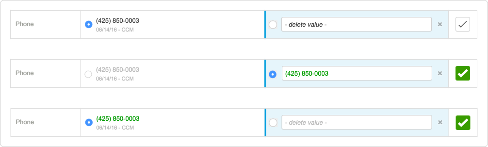
Applied new platform-wide color callouts
Call-to-action Blue: Highlighted critical differences between current and newly submitted values, guiding user attention to required actions.
Green Change Highlights: Marked all verified or modified values with a green text, and checkmark, reinforcing clarity and confirmation.
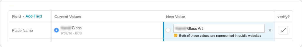
Added field-level notes for contextual clarity - Enabled users to annotate individual fields or entire records, providing targeted context within record history and improving collaboration and audit-ability.
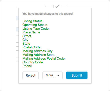
Introduced a changelist, boosting visibility, accuracy and speed - When edits were made, the action pane displayed: “You have made changes to this record” along with a green-highlighted list of modifications. This preview helped users validate edits before submitting, reducing errors and increasing confidence.
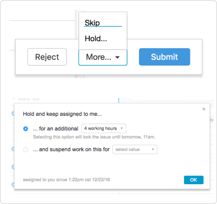
• Reduced misuse of the Skip function through improved workflow logic
Added a Hold option via a new “More” menu, allowing users to pause work and return to the record later.
Hold returned the record to the same user; Skip returned it to the team queue, both were tracked for accountability.
Enabled field-level suppression for sensitive data - Provided the ability to suppress specific fields, ensuring sensitive customer information was removed from future data deliveries.

I Designed scalable, user-centered experiences - Created scalable component patterns, system documentation, and high-fidelity prototypes that enabled rapid iteration and cross-functional collaboration with Engineering, Product Management, and Data Processing teams.
Fully functional prototypes

Many modals

RESULTS:
The overall internal tooling optimizations and engineering automations achieved a 97% efficiency gain, streamlining a 6-7 week process into a 24-hour data processing turnaround.
The Merge Review work stream exemplifies my UX focus at Data Axle, driving user-centered impact by unifying fragmented on-premise tools into a streamlined, cloud-based platform that accelerated engineering, empowered data-processing teams, and improved data quality for B2B and B2C customers.

The redesigned Data Axle cloud-based platform impact : per demographic
-
Unified Design and Development Standards - Implemented a research-led design process and a shared, Bootstrap-based design system that standardized components, patterns, and usability principles across all projects.
Improved Operational Efficiency - Reduced design and engineering overhead through reusable assets and consistent workflows, accelerating product cycles and enhancing long-term maintainability.
Stronger Visibility and Cross-Team Collaboration - Established clearer cross-team visibility into the research process, design direction, and implementation - strengthening communication between design and engineering.
-
Streamlined, Unified Data-Processing Platform - Centralized all ingestion, cleansing, and distribution workflows into a single cloud-based portal—eliminating fragmented tools, siloed processes, and redundant manual steps.
Standardized Definitions and Quality Measures - Established consistent metrics for data accuracy, fill rate, and quality, enabling teams to evaluate performance and downstream impact with confidence and real-time clarity.
Simplified, Consistent User Experience - Introduced a unified taxonomy, contextual page titles, WCAG-compliant color and component patterns, and clearer calls-to-action to create a coherent, end-to-end workflow across all data-processing tools.
Consolidated Documentation and Resources - Merged all data-processing documentation into a single, authoritative cloud-based repository—reducing confusion, improving discoverability, and supporting true self-service access.
-
Real-time, Scalable Data Delivery - Replaced static monthly data loads with real-time asynchronous feeds, enabling continuous access to the most current data.
Consistent, High-Performance Distribution - Standardized API delivery through AWS to ensure dependable, scalable, and high-performance data access across all customer touchpoints—without compromising speed or quality.
< Back to top
Data Axle - Platform branding
SITUATION:
The Data Axle Platform Team needed a distinct visual identity to stand out among internal data teams and communicate a modern, real-time data narrative to both internal stakeholders and external customers.
The Data Axle logo and Infogroup lockup in use, prior to the rebranding initiative.
PROCESS:
I began the Data Axle branding initiative with a focused research and discovery effort: 🤓
Data-Processing Team Insights - Early interviews revealed widespread misconceptions about the platform’s role and value. Many teams initially viewed Data Axle as duplicative of existing workflows. As conversations progressed, teams recognized its potential to unify processes, increase visibility, and deliver consistent data quality across ingestion, cleansing, and distribution.
Leadership Perspectives - Discussions with team leaders showed cautious optimism. While levels of skepticism varied, most leaders saw how a unified platform could streamline operations and create a stronger foundation for accuracy, accountability, and cross-team collaboration.
B2B/B2C Customer Insights - Customer interviews were highly positive. Users valued near real-time access to key datasets, transparent data quality metrics, and comprehensive documentation detailing packages, lookup tables, field translations, and API availability—core differentiators in the market. The primary request was stronger differentiation and reduced dependency on multiple legacy Infogroup data sources.
B2B / B2C customer interviews were most encouraging. Customers praised Data Axle’s near real-time access to key datasets, transparent data quality metrics, and comprehensive documentation detailing packages, lookup tables, field translations, and API availability, core differentiators in the market. The primary request was stronger differentiation and reduced dependency on multiple legacy Infogroup data sources.
Platform Vision Alignment - I met with the platform CTO to understand strategic positioning and long-term intent for the Data Axle brand and platform.
Branding & Positioning Audit - Conducted an audit of Infogroup’s existing product branding and customer positioning to identify opportunities for clarity, cohesion, and differentiation.
Synthesized and socialized research insights across teams, then led the definition of the initiative’s ideal UX statements and measurable goals, establishing a clear direction for subsequent iterations of the platform experience and identity.
Ideal UX statement:
“Internal teams and external customers clearly understand and trust Data Axle as the leader in real-time data quality, supported by branding that communicates continuous ingestion, cleansing, availability, and real-time distribution, with clear emphasis on search, submission, and subscription capabilities.”
Data Axle rebranding goals:
Reduce confusion and establish a unified message across all customer touchpoints.
Strengthen clarity and alignment in support, sales, and partnership conversations.
Improve consistency in conference presentations and public-facing materials.
Process continued…
Conducted brand and industry audit
Analyzed B2B and B2C data industry branding, visual systems, and customer positioning to identify differentiation opportunities for Data Axle.
Combined external audits with internal stakeholder interviews to define the platform’s unique value narrative.
Designed a modern, scalable identity system
Created a standalone logo symbol for use in compact use cases (favicons, icons).
Developed a combination mark pairing the symbol and wordmark for broader brand application.
Validated design direction through cross-functional collaboration
Presented concepts to platform, branding, and marketing leaders to gather iterative feedback.
Reviewed with the CEO to refine messaging and ensure alignment with the larger organizational vision.
Refined and finalized the identity through iteration
Integrated feedback from leadership and cross-functional teams to strengthen the logo system and express the platform’s technological rigor and reliability.
RESULTS:
Delivered a modern, differentiated identity that elevated the Data Axle platform above fragmented legacy tools and clearly communicated its real-time data ingestion, cleansing, availability, and distribution capabilities, along with its core strengths in search, submission, and subscription.
Implemented the identity system across all brand touchpoints, including:
Cloud-based platform UIs and documentation
Company newsletters, presentations, and marketing collateral
Infogroup web properties and digital assets
Business cards, stationery, stickers, and a dedicated office mural


The new identity, paired with the success of the Data Axle platform, its data-processing software, APIs, and real-time technologies, established a trusted, unified symbol of data quality across teams and customer experiences. This strong combination of technical innovation and cohesive design ultimately led Infogroup to rebrand the entire company around the Data Axle name, visual system, and platform principles.
< Back to top
Data Axle - Visual identity system
SITUATION:
Customer research and prospect conversations revealed significant communication gaps. Data Axle’s complex technologies, data models, and workflows were difficult for non-technical stakeholders to understand, signaling a need for a clearer, capability-driven visual narrative that could bridge these discussions and improve comprehension.
PROCESS:
Cross-functional reviews through workshops and UX office hours enabled a shared ownership of the emerging visual approach, additional validation testing with customers helped solidify that the proposed visual system would support both internal and external audiences while maintaining technical rigor. These conversations helped frame and define the ideal UX statement and drive key initiatives.
Research Insights -
Users across all audiences welcomed an added visual layer to clarify concepts and improve understanding.
The primary design challenge was ensuring that illustrations enhanced clarity and accuracy without distracting from or oversimplifying technical content.
Ideal UX statement -
“Enable a clearer learning path and stronger conceptual understanding of Data Axle’s capability-driven value, improving accessibility for less-technical users while maintaining trust, quality, and technical accuracy for all.”
Key initiatives:
Extended the visual language established during the Data Axle logo work, anchored in ingestion, cleansing, and real-time availability, to build a cohesive illustration system.
Led workshops and feedback loops with product, engineering, and data-processing teams to ensure alignment and reinforce shared understanding.
Tested multiple concepts with users to balance visual clarity with technical accuracy and avoid introducing bias or oversimplification.
Continued iterative illustration development to support the evolving platform narrative.
RESULTS:
Created a unified illustration and infographic system that clarified platform capabilities and strengthened technical conversations through capability-driven visual storytelling.
Expanded the visual narrative to represent Business data, Consumer data, and B2C database content.
Applied the illustrative language to API artwork, improving comprehension for both technical and non-technical audiences.
Maintained and evolved the visual system in parallel with the platform’s continual growth and shifting data capabilities.
Database logos
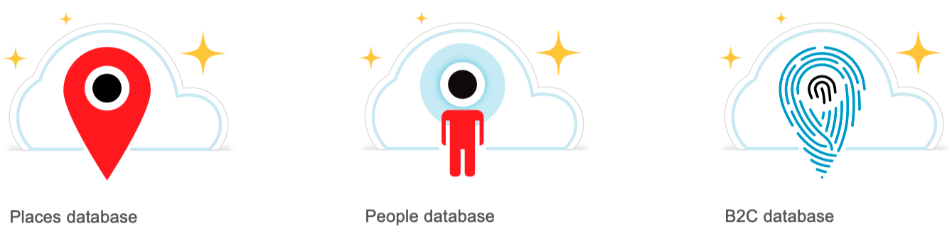
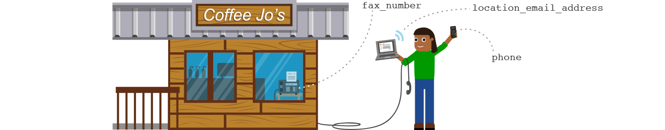
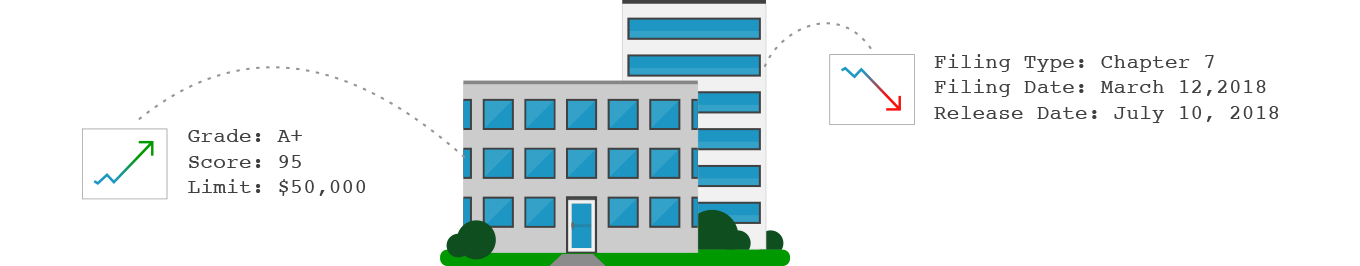
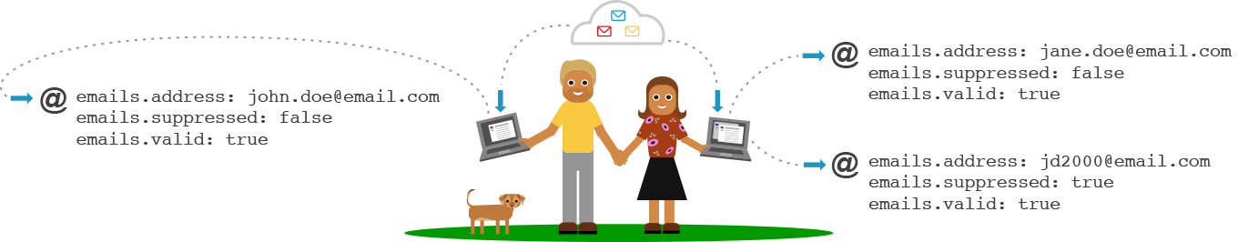
Places = Business data - 20 million records | 200M contacts | 469 attributes
People = Consumer data - 300M records | 500M emails | 311 attributes
B2C = 116M B2C links | 88M business emails | 415 attributes
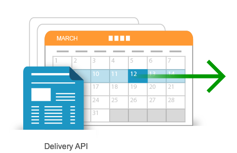
API artwork


Platform artwork
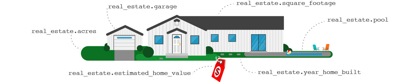
Created Illustrations, infographics, and data visualizations to supplement conference media, presentations, monthly newsletters, and email blasts, providing a more colorful and approachable understanding of the concepts and technologies available through Data Axle.


Data Axle Conference animation

Narrated by our CTO at the conference (narration not available).
The Data Axle visual identity system evolved into a vibrant, capability-driven design language that clarified complex technology across products, presentations, and stakeholder interactions. Through simplified visual narratives and UX storytelling artifacts, I helped cross-functional and non-technical customer stakeholders quickly understand impact, align on priorities, and gain confidence in Data Axle’s capabilities and long-term vision.
< Back to top
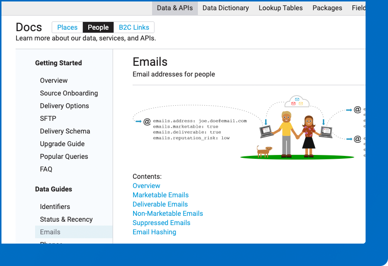
Data Axle - Cloud-based documentation
SITUATION:
Documentation was fragmented, inconsistent, and often overly technical, with no version control or single source of truth. Quality and accessibility varied widely, leaving internal teams and less-technical customer stakeholders struggling to understand Data Axle’s data, services, and API capabilities. This lack of clarity increased reliance on support and engineering, creating significant operational debt and slowing platform adoption and evolution.
PROCESS:
I audited all existing documentation across teams, partnering with Product Management and Engineering to identify communication gaps, surface improvement opportunities, build cross-functional alignment, and define the ideal UX statement for the documentation experience.
Ideal UX statement:
“Provide clear, cloud-based documentation from a single, accessible source of truth, simplifying complex platform concepts and communicating capability-driven value for both internal teams and external users.”
Goals -
-
Consolidated fragmented resources into a single documentation system for Business, Consumer, and B2C data, improving clarity, consistency, and access.
Created a portal with clear categorization and navigation across datasets and API documentation.
-
Data
API documentation
Data Packages
Lookup tables
Field Translations
-
Provide a helpful visual narrative for Data Axle data when useful to bridge comprehension.
Continually expand and validate.
-
Continue to socialize user sentiment
Continue to Identify common patterns, communication gaps, and requirements.
PROCESS:
This work required iteratively consolidating all data into a single cloud-based portal and refining the experience based on ongoing user feedback.
RESULTS:
I designed and iteratively refined a cloud-based documentation portal that consolidated all data resources into a single, navigable source of truth. Using Data Axle’s visual identity system, the portal translated complex platform capabilities into clear, accessible guidance for both technical and non-technical users.
The unified portal enabled true self-service, reduced reliance on support and engineering, and fostered a shared understanding across teams, strengthening cross-functional collaboration and accelerating product adoption.
“Data Axle’s online documentation is our new knowledge center for Infogroup’s core databases.”
- Mike Iaccarino, 2020 - Data Axle CEO
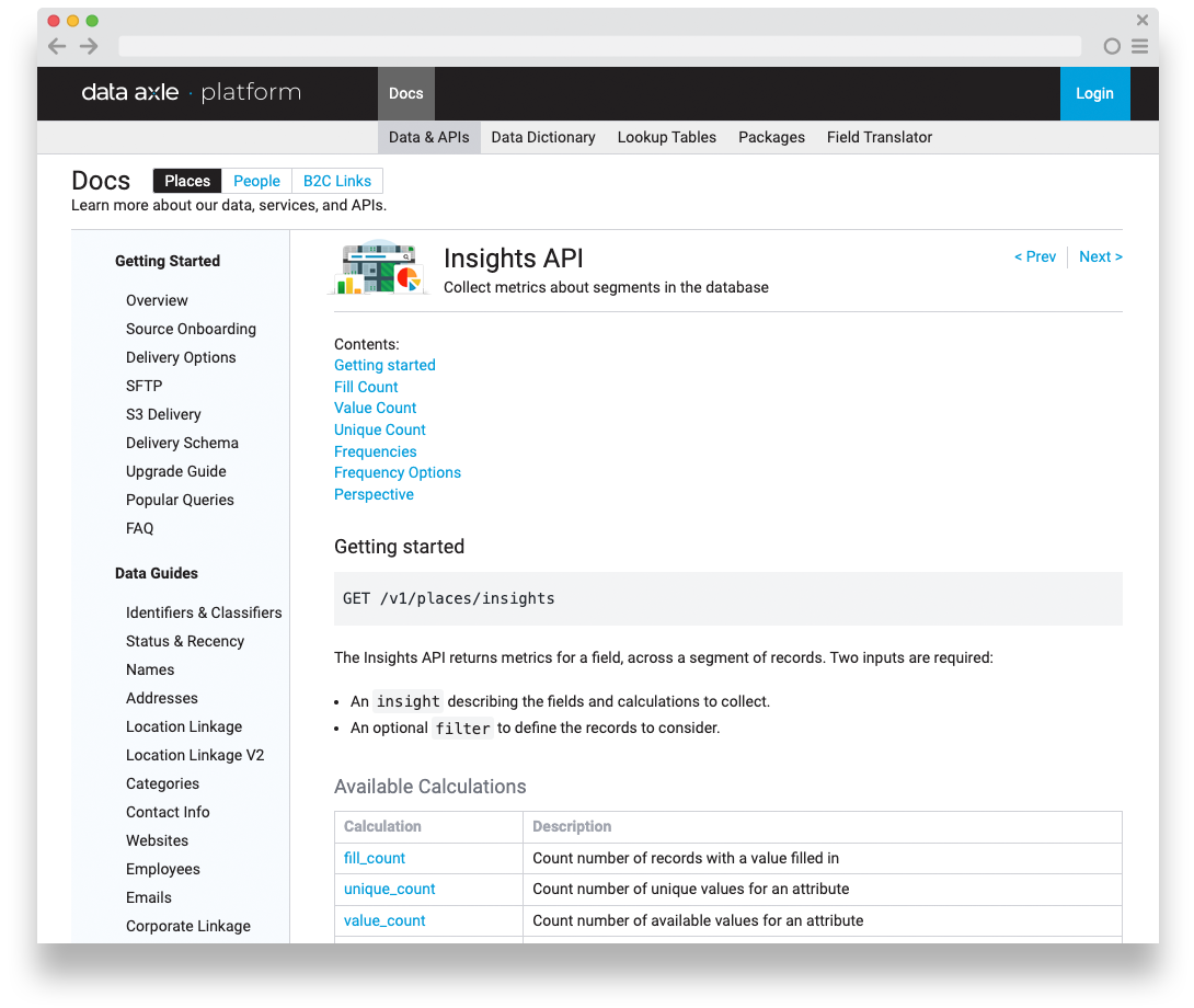
API documentation example:
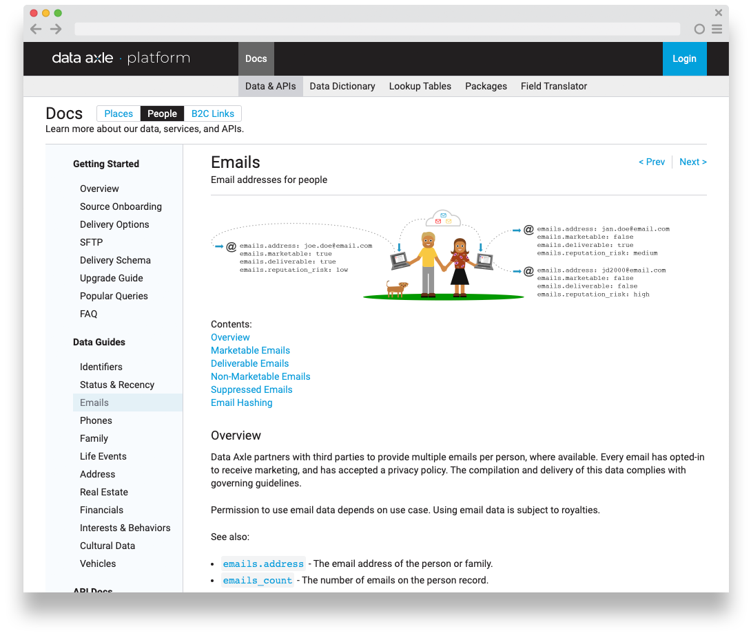
Data Guide example:
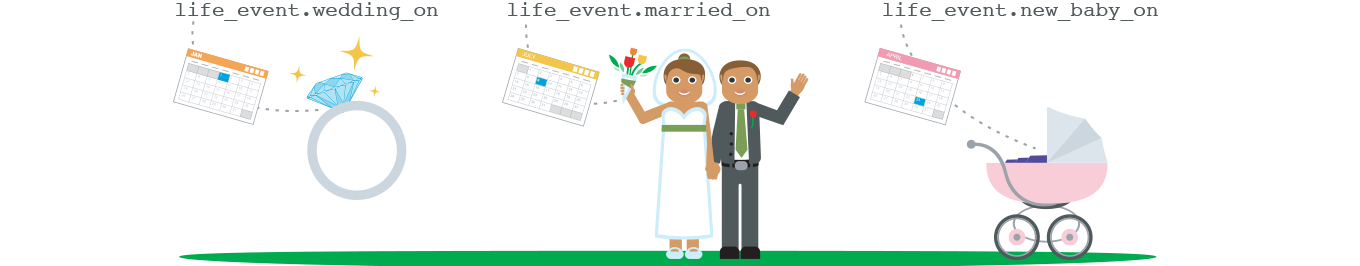
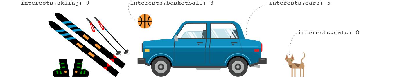
Additional illustrations


Other documentation page examples:
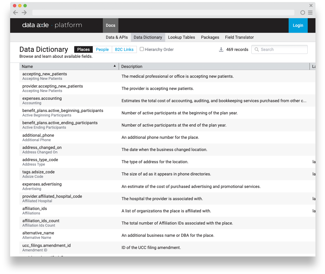
Data Dictionary - Definitions of all the data fields available in Data Axle.
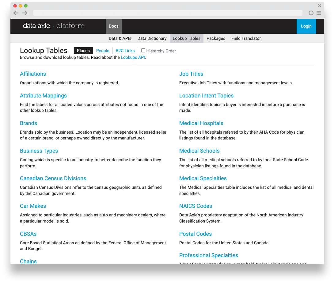
Lookup Tables - efficient repositories for predefined values / mappings
Packages - predefined data segments

Field Translator - Legacy system / Data Axle translations
Overall impact
I led a UX-driven transformation of Infogroup’s data-processing pipeline, internal tooling, platform branding, visual language, and cloud-based documentation, aligning design and engineering around a unified, scalable vision, that accelerated cross-team efficiency, and significantly increased productivity for both internal teams and customers.
The Data Axle platform became the trusted standard for real-time data quality across the organization and for B2B/B2C customers. This combination of technical innovation and cohesive design was transformational for Infogroup, shaping its long-term strategy and ultimately driving the company-wide rebrand to Data Axle.
P.S. Here’s a little positive press from my time at Infogroup/Data Axle…
Infogroup announced as a leader in the Forrester Wave -
B2B Marketing Data Providers 2018 report
Key findings regarding Infogroup in the report:
Infogroup received the highest possible score in several criteria, such as data management, integrations and APIs, go-to-market strategy, product roadmap, revenue, and customer base.
The report highlighted Infogroup's capability to identify and integrate personal and professional insights on executive buyers for improved targeting and personalization.
Infogroup's advanced data management was noted for enabling customers to integrate data sources and create detailed profiles.