

Achieved a 97% efficiency gain in data processing by leading design outcomes that automated and optimized high-friction workflows
I joined the Data Axle platform team to lead UX strategy, defining the UX outcome of promoting the Data Axle platform as Infogroup’s leader in data quality, and standardizing all client-based software to one cloud-based platform. Through cross-functional iteration, I led research and design to achieve this outcome, creating a 24-hour process with API access for a 97% efficiency gain.
Explained in 5 micro-case studies.
3 - Designing and illustrating the platform team’s visual identity system
4 - Crafting cloud-based documentation with a visual narrative to engage less-savvy product leaders
5 - Designing Self-signup and free trial workflow to empower user onboarding at scale while reducing support overhead.
This work redefined data processing, built trust with B2B partners, enabled self-service, and reduced support costs.
My role:
User research | Design | Illustration | Design socialization and cross-collaboration with Support, Data Cleansing | Product Management, Engineering, Marketing and Branding teams.
1 - Creating intuitive internal tooling to power data-driven decisions in a cloud-based data processing platform
CHALLENGE:
Infogroup’s data processing (ingestion, cleansing, distribution) spanned six siloed teams, lacked end-to-end ownership, and resulted in inefficiencies, inconsistent data quality standards and a time-intensive 6-7 week process.
User research revealed a highly manual process that required multiple engineering and data-cleansing teams and resulted in a massive amount of redundancies. The process to ingest, clean, and distribute data utilized a number of overlapping processes and software solutions that took on average 6-7 weeks.
6 data cleansing teams used different tools and processes
teams had different methods to measure data quality
teams had different methods to ingest and distribute data.
Software for a number of the tools was ASCII based, key-code software that required an immensely high learning curve, was difficult to update, and required on-premises access in Omaha, NE.
Developers were using varied methods for research, design, component creation, and pattern usage, resulting in highly inconsistent user experiences.
GOAL:
Our UX Outcome was to unify and simplify the numerous on-premises workflows and software solutions into a single end-to-end cloud-based pipeline solution for data ingestion, cleansing, and distribution, and ensuring high-quality data.
Standardize on a universal definition of accuracy, fill rate, and quality
Define a common component system and pattern library
Reduce redundancies
PROCESS:
I championed UX culture and drove cohesive design direction and strategic, scalable vision for the data platform team.
Led a collaborative UX research environment, conducting and synthesizing research studies of senior stakeholders, data-cleansing teams, support and engineering teams
Socialized research insights and led design workshops that provided an inclusive, participatory, data-driven design culture.
Component and pattern library management, socialization and documentation
Designed software experiences
Created high-fidelity prototypes
OUTCOME:
I designed a reusable component system and pattern library that reduced engineering effort while delivering a consistent, cloud-based software experience and included robust documentation. The UX empowered data teams to make faster, more informed decisions with clear visibility into the full pipeline and their impact on data quality, resulting in a 24-hour data turnaround and a 97% efficiency gain.
Consistent definition of quality across teams
Creation of a standardized component library with consistent interaction patterns
Consistent taxonomy
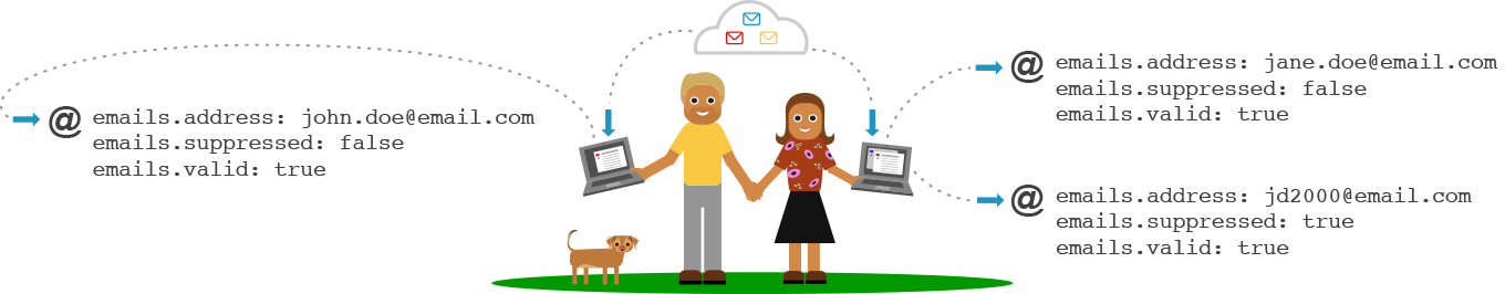
Ability to ingest and distribute through API access via AWS
2 - Designing Data Axle’s differentiating branding
CHALLENGE:
Data Axle platform team needed a bold visual identity to stand out within Infogroup’s fragmented data ecosystem and within the B2B/B2C data industry
GOAL:
Create impactful branding to position Data Axle as the leader in data quality, with a focus on real-time data ingestion, cleansing, availability, and distribution, while highlighting search, submission, and subscription capabilities.
PROCESS:
Audited the multiple Infogroup data processing team’s branding and customer positioning
Audited B2B/B2C data industry branding and customer positioning
Leveraged these audits and internal stakeholder input to design an impactful logo and identity that reinforced Data Axle platform’s core strengths.
Collaboratively refined with platform, branding, and marketing teams.
OUTCOME:
Designed a Data Axle logo inspired by core real-time platform technology of data ingestion, cleansing, availability, and distribution, while highlighting search, submission, and subscription capabilities.
Extended the logo use to all platform software branding, business and conference collateral, and an office environment mural.
Created a modern branded solution that differentiated the platform team solutions from other fragmented Infogroup teams, and was aligned with industry branding trends
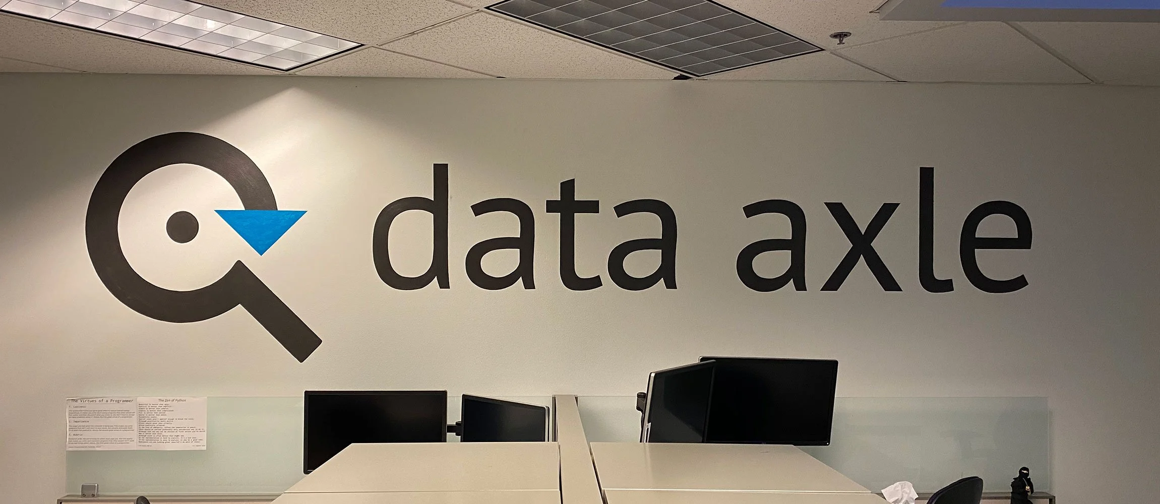


This work enabled the Data Axle platform to provide a visible, consistent, trusted signal of data quality across internal teams and for Infogroup customers. The impact was so strong, the company adopted Data Axle as its new name, rebranding entirely around the platform’s principles, design, and proven success.
3 - Designing and illustrating the platform team’s visual identity system
CHALLENGE:
Research indicated communication gaps and a need to simplify the conversation around the complexity of the technology and processes in order to effectively communicate the clear, capability-driven value to less-savvy thought leaders (who weren’t engineers).
I had been illustrating various concepts for infographics and data visualizations for technical conversations, presentations, and conference media that aligned with our data-driven platform branding narrative (data ingestion, cleansing, availability, distribution and search, submission, and subscription capabilities). This initiative simply defined the long-term intended outcome of the visual narrative and continued support.
GOAL:
Bridge the gap for less technical individuals.
Support technical concepts with clear visual narratives and data visualizations to enable a more effective learning path and better conceptual alignment of the capability-driven value, for less-technical users, while promoting trust, quality, and technical accuracy for all users.
PROCESS:
I conducted UX research and design iterations with broad socialization and cross-functional participation to help bring the teams along with me in this illustration adventure. Then socialized the insights. I needed confirmation that I was hitting the right notes.
Research insights
All user bases would welcome the additional layer of capability-based visual clarity
The largest concern and my primary design challenge was to ensure that any added images provided clarity and deepened user comprehension without oversimplifying the intent
Socialized all concepts and designs across product and engineering teams for coverage and alignment
Usability tested a number of concepts to ensure a balance between visual language and technical content was achieved
Continued Iterative illustration, and long-term support for the vision
I utilized and extended the messaging, intention, and visual style of previous visuals I had created for the Data Axle platform logo (data ingestion, data cleansing and real-time data availability)
OUTCOME:
Connected real-world use cases with platform data and capabilities, by creating a visual identity system for Illustrations, infographics and data visualizations.
Created more approachable, consistent visual language, providing levity to the dry technical documentation that was focused mainly on implementations.
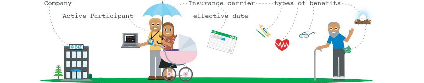
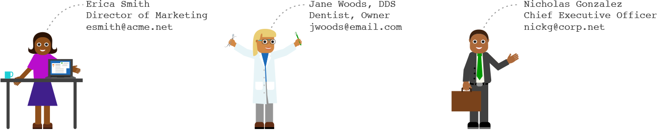
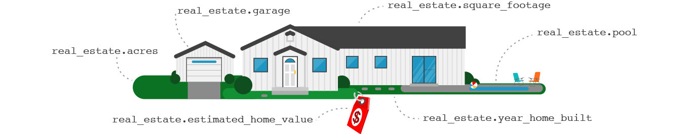
Extended the visual narrative to support Business data, Consumer data, and B2C database content.
Updating and adding to this visual language was a constant task moving forward, as the narrative of Data Axle data was in constant evolution.
Database logos
Created logos for the platform’s 3 distinct databases:
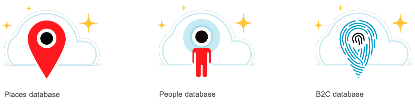
Places = Business data
People = Consumer data
B2C = Linking between Business data and Consumer data
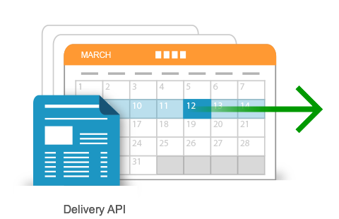
API artwork
I utilized and extended the intention and visual style of the Data Axle logo and previous platform artwork, while focusing on specific intent of each API.
Created a card-like structure that could be replicated across our API family to create distinct illustrations that represent platform core functionality, while alluding to Data Axle search, submit, and subscribe tenets.


Platform artwork
Created Illustrations, infographics, and data visualizations to supplement conference media, presentations, monthly newsletters, and email blasts, providing a more colorful and approachable understanding of the concepts and technologies available through Data Axle.


Conference animation

Narrated by our CTO at the conference (narration not available).
The Data Axle visual identity system evolved into a vibrant, capability-driven design language and a visual partner that brought clarity to complex data across the platform software, presentations, conferences, and stakeholder interactions, enabling a more intuitive, effective experience for both less-savvy and expert users.
4 - Crafting cloud-based documentation with a visual narrative to engage less-savvy product leaders
CHALLENGE:
Inconsistent Documentation was fragmented, highly technical for less-savvy thought leaders, and lacked a central depository with version control, forcing internal and external users to rely heavily on support teams. This created significant support debt and blocked efficient platform adoption.
GOAL:
Reduce documentation inconsistencies and redundancies and enable effective cloud-based documentation from one accessible and consistent source of truth. Utilize Data Axle’s new logo and visual identity system and extend the visual language to documentation. Users needed documentation that simplified the complexity of platform technology and effectively communicated the clear, capability-driven value to less savvy thought leaders (who weren’t engineers).
PROCESS:
I Led research and discovery efforts to understand what documentation was available and highlight communication gaps, then designed a cloud-based documentation portal that provided ease-of-navigation and comprehensive coverage.
Socialized documentation insights, identified common patterns, opportunities to improve, communication gaps, and aligned on requirements
Consolidated fragmented team resources into a unified documentation system for Business, Consumer, and B2C data, improving clarity, consistency, and access.
Designed the cloud-based platform documentation portal that included categorization and ease of navigation across data-sets and API documentation
Initially, we assumed a parallel, capability-focused text explanation would help less-technical users, but research revealed it bloated the documentation and hindered the experience for more technical audiences.
Through additional user research, I defined an opportunity to explain these capabilities through infographics and documentation illustrations that utilized our visual identity
Created documentation redesigns that incorporated this concept
Created functional proof-of-concept prototypes for users to navigate and provide more targeted feedback through validation testing
Worked with the platform team to implement and support over time
This became an ongoing, evolving process that paralleled the evolution of our data story
OUTCOME:
Created highly useful and easily accessible online documentation.
Sales teams, data-cleansing teams, technical support teams, internal engineering teams and B2C/B2C end-customers had access to the most current documentation from one consistent, trusted source
The new cloud-based documentation was accessible and easy to navigate with the ability to switch between People/Consumer data, Places/Business data and B2C linking data
Documentation included:
Data & APIs
Getting Started and Onboarding
Data Axle data and Delivery Schema Introductions
FAQ and Support access
Data Guides - all data segments
Data Dictionary
Lookup tables
Packages
Field Translators
Illustrations extended the Data Axle branding look and feel into a more robust, holistic visual identity
Verbiage, taxonomy, and overall messaging were iteratively updated and adjusted as our offerings evolved.
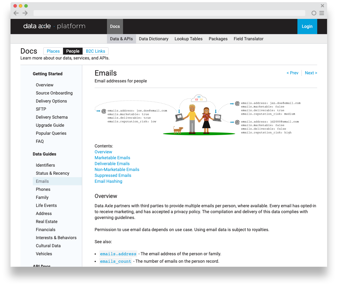
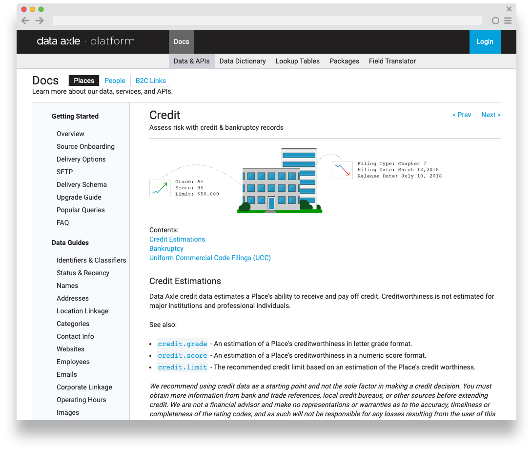
Utilized API illustrations in API documentation
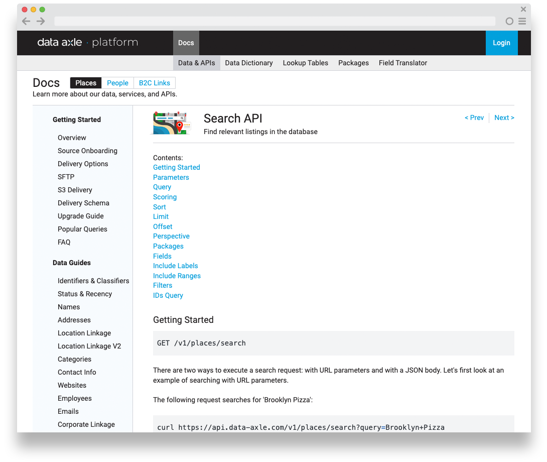
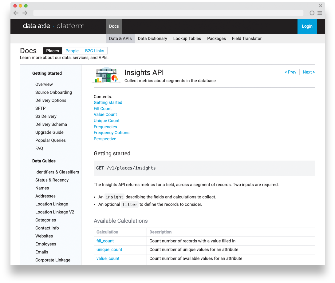
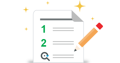
3 Data Guide examples with illustrations

Additional illustrations

Other important documentation pages
Data Dictionary - Definitions of all the data fields available in Data Axle.
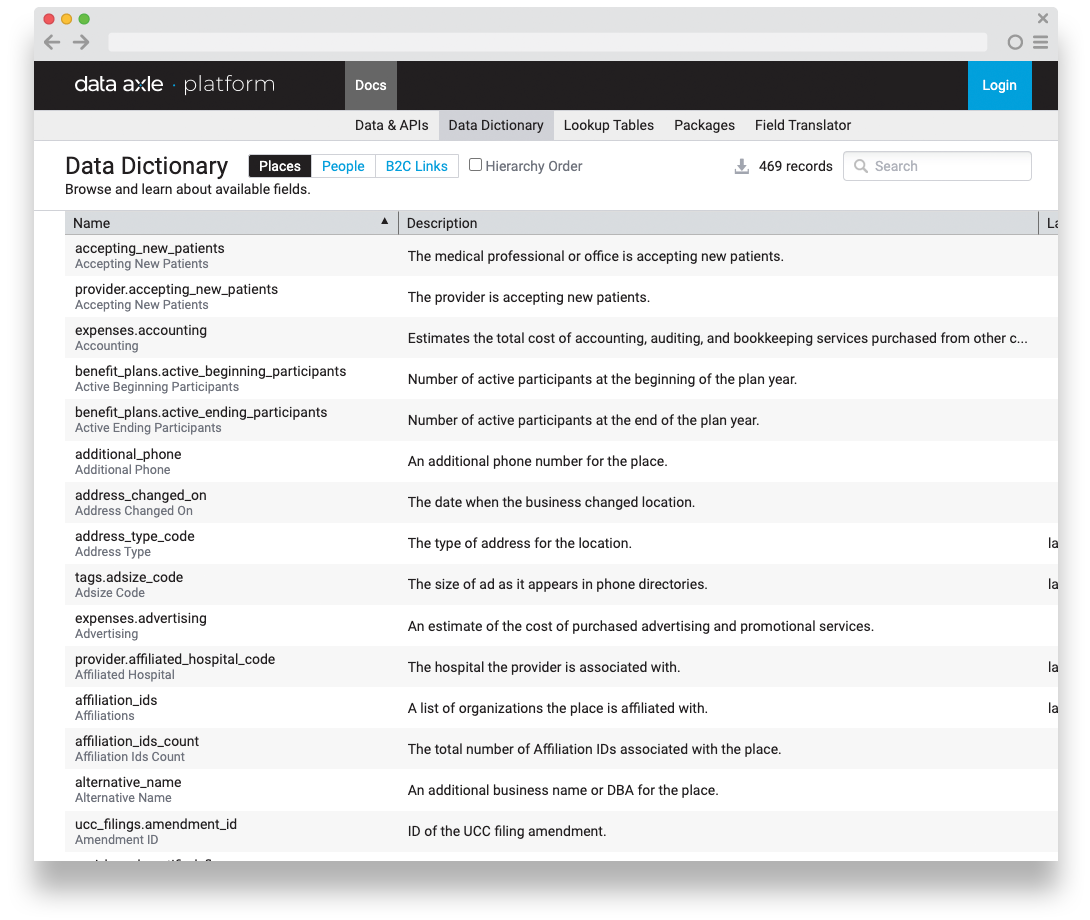
Lookup Tables - efficient repositories for predefined values / mappings
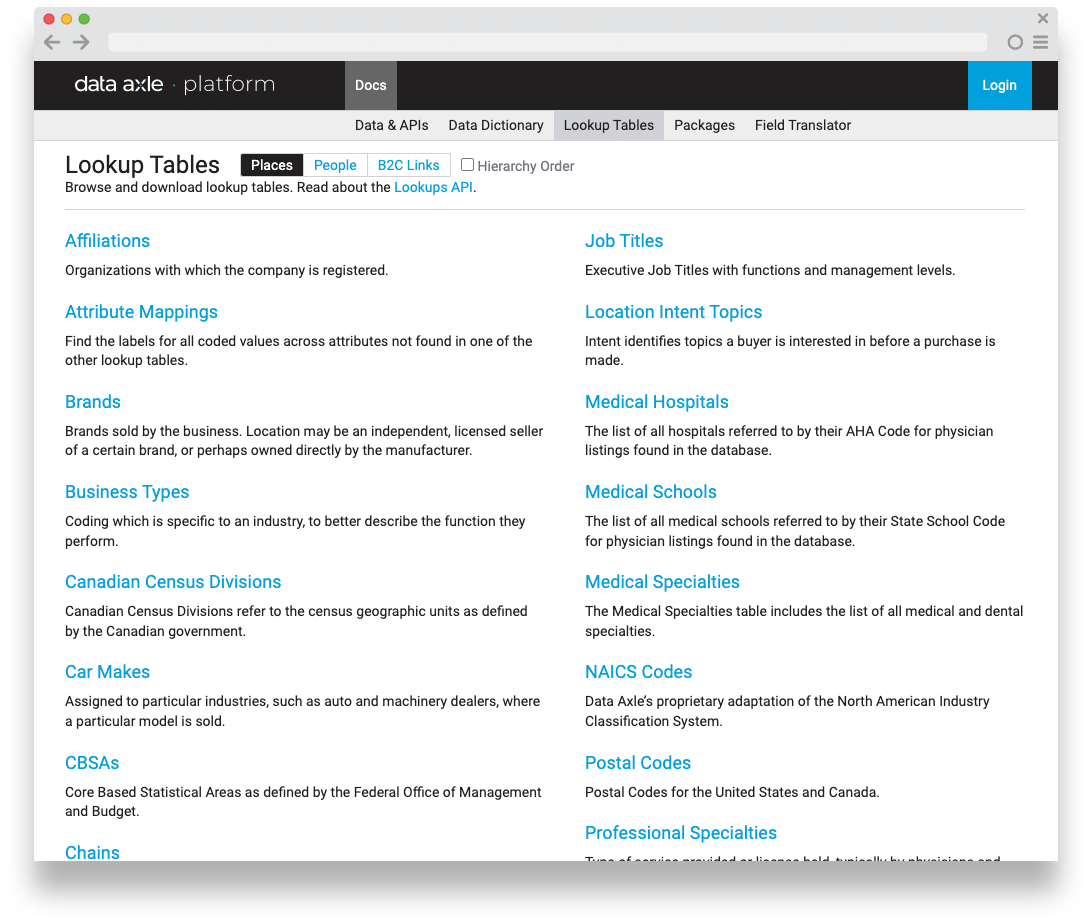
Packages - predefined data segments

Field Translator - Legacy system / Data Axle translations
The new Data Axle cloud-based documentation enabled valuable access to self-service support documentation and a comprehensive guide for internal teams and both new and existing customers, empowering technical teams and their less-savvy cross-functional partners with a deeper, shared understanding. 👍🏼
5 - Designing Self-signup and free trial workflow to empower user onboarding at scale while reducing support overhead.
CHALLENGE:
The onboarding process required substantial introductory relationship management and hand-holding for each new customer. Due to successful initiatives enabling customer engagement and productivity, our platform product managers, engineering, sales and support teams were regularly randomized with new or prospective customer discussions about our data solutions, technologies, setting up free trials. This was a good problem to have, but one that sidetracked our team away from product work. 🙃
GOAL:
Create a self-signup process for customers to register for a free trial of our platform's APIs and technologies. This introductory process would help users understand our data model better and clarify their future interactions. Users would be able to select and filter datasets that suit their business needs while learning about our products and services. This process would educate users about our data model and reduce the need for heavy Product Management, Sales, and Support education and onboarding, resulting in unilateral cost savings.
PROCESS:
Partnering with engineering leadership, platform team engineering, key stakeholders, support team and external users, I drove a cross-functional, user-centered research and data-driven design process.
Conducted and synthesized research studies across multiple product offerings, each with its own authentication and heavy support signup process.
Socialized research and design through cross-functional workshops to gain internal feedback and promote a common understanding of the customer’s journey, and expectations across all workflows
Designed and prototyped cohesive workflows
Conducted usability studies to validate positioning and flow.
OUTCOME:
I designed a self-signup workflow for account creation with a free 30-day trial of our business, consumer or B2C data.
Empowered customers with hands-on engagement and learning
Substantial increase in self-signup activity and data licensing
Dramatic reduction of product management, sales and support randomization, enabling reprioritization of time for other important business initiatives.
Operational cost savings for internal teams
Free 30-day trial for customers to better understand our data and what they want prior to financial discussions in their organization
Highlighted the need to expand self-service efforts 🧐
Unfortunately, this story is a little light because I was not able to see this effort through due to a company-wide restructuring. I wasn’t able to gather more details. 🙃
I led a UX-driven overhaul of Infogroup’s data-processing pipeline, software and platform team’s visual language — uniting design and engineering to transform Infogroup’s culture, accelerate cross-team efficiencies, and elevate user productivity! 🤓
The Data Axle platform became synonymous with data quality and trust both internally and externally for our B2B customers. These initiatives were transformational for the platform team and Infogroup as a whole, and heavily influenced a reimagined company-wide strategic long-term vision and rebrand to Data Axle.
P.S. Here’s a little positive press from my time at Infogroup/Data Axle…
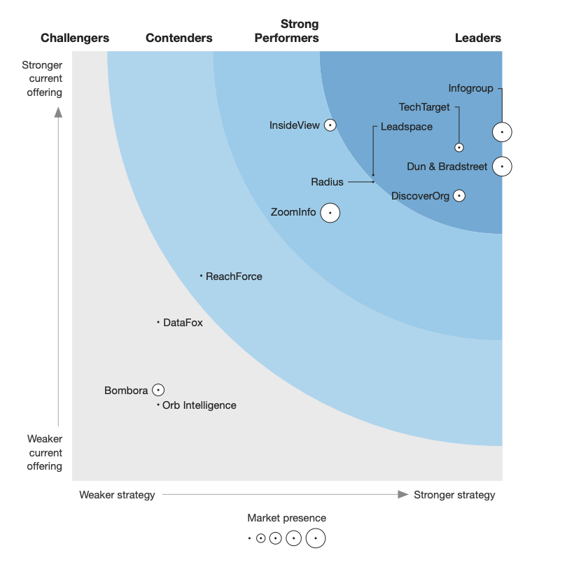
Infogroup announced as a leader in the Forrester Wave™: B2B Marketing Data Providers 2018 report
Key findings regarding Infogroup in the report:
Infogroup received the highest possible score in several criteria, such as data management, integrations and APIs, go-to-market strategy, product roadmap, revenue, and customer base.
The report highlighted Infogroup's capability to identify and integrate personal and professional insights on executive buyers for improved targeting and personalization.
Infogroup's advanced data management was noted for enabling customers to integrate data sources and create detailed profiles.
Hello there! 😊
Have any questions or want to discuss? Connect with me on Linkedin or send me a message below to hear more.